Monthly Archives: January 2009

Howdy!

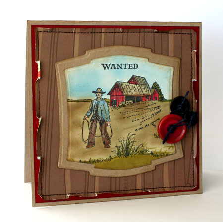
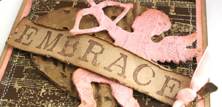
Well, there’s nothing much western about me but I thought I’d have a little fun creating in a western theme for today’s design. Actually, I’ve been dying to use this gorgeous Prima “Down Home” flower for ages and pairing it up with this Paisley Pattern Scrapblock™ seemed to be a natural fit. I’ve been enjoying creating different looks with this Scrapblock™ and stamping on Kraft with Denim Adirondack Pigment ink gave a great look.  Add in a little texture, some distressing and stitching and you have a really warm, homey look.

Western Hello

jks-western-hello.jpg

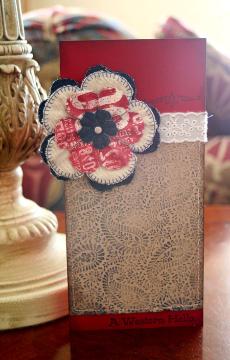
Quick Tip: Add a little variation to your designs now and then by trying out a different card  size than you normally use. This card measures 4″ x 8.5″ and the extra size really helps balance off the size of this beautiful flower.

Take care and thanks for stopping by!
winter-julia.jpg

Supply List:

Stamps:
For the Men (Rummage Bin line) by Cornish Heritage Farms
Paisley Print Scrapblock™ by Cornish Heritage Farms
Ink: Denim Adirondack Pigment ink by Ranger, Black Memento Ink by Tsukineko, Walnut Distress ink by Ranger
Paper: Blush Red Dark, Kraft cardstock by Prism
Other: lace, flower embellishment by Prima, sewing machine

Simply Saturday… simply happiness

jks-one-happiness-slice.jpg

A simple, spring flavored card to share with you today. I’m so in love with January’s Freesia Stamp of the Month combo that I don’t want to put it down. Whether you want to create simple but stunning cards stamped monochromatically, or make more ornate designs…this stamp does it all. When I first saw a peek of what this stamp would be, I just knew I wanted to try stamping a tone on tone background with it and that is what I’ve done in this design. Actually…now that I think of it, this card design is not only simple, it also only uses two ink pads, three colors of cardstock and one single brad. If you’re looking for this gorgeous stamp combo, you can find it here.

Wild winter temps are moving back into Ontario so I’m bundling up at home today and enjoying dreaming of Spring!

One Happiness

jks-one-happiness.jpg

Quick Tip: Stock up on classic cardstock colors that you use often so you never run out. At the top of my must-haves Simply Smooth white, Kraft, black and a dark brown. Close behind are my favorite accent colors….Spring Willow Light, Blush Red Dark, Frosted Teal by Prism.

Have a simply wonderful day!
Supply List:
Stamps: Freesia and One Happiness (Jan 2009 SOTM) by Cornish Heritage Farms
Ink: Willow Adirondack ink by Ranger, Burnt Umber Palette Ink by Stewart Superior
Paper: Simply Smooth White, Kraft & Spring Willow light by Prism
Other: brad by Basic Grey

I’ve Scene-it

Now here’s a little design that you don’t often see here. Actually…it’s a bit of a stretch for me and not my usual style but a change of pace is always a good thing. This design is pieced together from the new Scene-it stamp set called The Ranch. If you’re someone who loves to create your own scenes…this great line all works together on the same scale. While I stuck to just using the one set, if you had the Mountains set…you could realistically add mountains in the background and basically design whatever scene your heart desires. The Ranch  is released today from Cornish Heritage Farms.

 Wanted

jks-wanted.jpg

To put together a scene, the easiest way is to plan it out on a scrap paper first. That way you can quickly see how the elements work together and which ones will need masking. When creating a scene you need to start with the foreground first and then work back to the distance. After stamping, add color to your design. I used Copic markers but watercolor, sponging with ink or colored pencils always looks great as well.

Quick Tip: Stamping scenes can be time consuming. Start out creating small scenes until you are more comfortable, then get more complex.

Take care!
winter-julia.jpg
Supply List:

Stamps: The Ranch (Scene-it line) by Cornish Heritage Farms
Ink: Black Memento by Tsukineko, Vintage Photo Distress ink by Ranger
Paper: Blush Red Dark, Kraft, Natural Smooth by Prism, Mr. Campy patterned paper by Cosmo Cricket
Other: sewing machine, labels 2 die by Spellbinders, Copic markers, buttons by Autumn Leaves, Copic airbrush

Patterned paper pizazz

jks-butterfly-sky-close.jpg

I have a totally different look for you today. Fresh and clean, I just adore this patterned paper. Actually…I have quite an addiction to beautiful papers going on. The papers that really have me drooling right now are all those gorgeous glittered, embossed, flocked or otherwise embellished papers. You know the kind. The ones that put a serious dent in your wallet! I know everyone is pretty budget conscious right now and so, I thought it would make a perfect challenge today! Pull out your patterned paper and find Ways To Use it by making it special. Alter it, emboss it, glitter it…I’d love to see your very cool ideas.

Butterfly Sky

jks-butterfly-sky.jpg

After I got this paper home, I was struck by how well it would work with the Vintage Butterflies stamp set. I did a little ink testing until I found the perfect inks to match up with the paper… Aqua and Watermelon Adirondack Inks. No fancy stamping in this design…the feature is the glittered butterflies on the patterned paper. The paper is so crisp and clean in style that is just doesn’t suit a lot of frou frou.

To easily add glitter exactly where I want it…I use my Sakura Glue Pen. It’s just like a gel pen only holding glue. Working in small areas so that the glue doesn’t dry too quickly…I traced the butterfly shapes and then sprinkled with glitter. It’s super easy and I love the look.

Quick Tip: Know when to quit with your design. More is not always better and can look cluttered. Decide on the focal point of your design and highlight it.

Have fun with the challenge!
Supply List:

Stamps: Vintage Butterflies (Saturday Evening Post line) by Cornish Heritage Farms
Ink: Watermelon, black, Aqua Adirondack Ink by Ranger
Paper: Simply Smooth White, patterned paper by American Crafts

Other: buttons, Nestability dies by Spellbinders

Roses are…

jks-birthday-rose-slice.jpg

Roses are….yellow! At least they are for this Thomas Kinkade design, a Perfect Yellow Rose. Actually, this image looks perfectly stunning in any color but I decided to try and color it true to the original for this design. Now I hear that yellow is one of the hot and trendy colors for 2009 but I still have to wrap my mind around it. I’m not so much of a yellow kind of gal. I decided to try out a softer look for this design and tried out a new trick that’s been spinning around in my mind for a while. I love it when you finally get time to try something out. I really need to write them down for those times when I’m a little lacking in inspiration. Do you have days like that too?

Birthday Rose

jks-birthday-rose.jpg

To create this project, I started off by coloring my stamped image with Copic markers. A few touches of colored pencils helps soften some of the shading and add finer details. Then comes in the vellum card. I love vellum for card bases…it gives such a soft, but crisp look. After piercing a small hole in the front of my card where I wanted to tear my hole, I stitched the image to the back of my card front. Tear away excess vellum until you have a desired window and then carefully roll back the edges for a textured “frame”.

Quick Tip: Cut a piece of white cardstock 1/4″ larger than your main image. Adhere to the inside of the card. It makes a perfect mat when the card is closed and a spot to write your message inside on.

Have a fabulous day!

winter-julia.jpg

Supply List:

Stamps:
A Perfect Yellow Rose (Thomas Kinkade line) by Cornish Heritage Farms
A Birthday Rose (sentiment from Thomas Kinkade line) by Cornish Heritage Farms
Ink: Rich Cocoa and Black Memento Ink by Tsukineko
Paper: vellum cardstock and Simply Smooth White cardstock by Prism
Other: sewing machine, yellow ribbon by Creative Impressions, Copic markers

Embrace …. Feel the Love

jks-embrace-slice.jpg

I love a good challenge and this is one I just couldn’t resist. It’s been a few months since I last managed to play along with the monthly “Dirty Girls” challenge at Splitcoast. I always hate missing it and so this month I made sure it went on my calendar right away. The challenge? Feel the Love…. a great Valentine’s Day challenge with the emphasis on “feeling”, aka texture. I ADORE texture and of course, I just had to squeeze in as much as I could on one little card design. So, each month besides the theme (Valentine’s Day), we have a required element (texture) and a restricted element…this time no red. Pink was OK so I went with a pink, Kraft and Chocolate color combo.

Embrace

jks-embrace-2.jpg

So….where’s all the texture here? I’m sure you can see most of it! But here’s a quick list…

  • velvet ribbon
  • Distress Embossing powder to create the background
  • Distress Crackle Paint on the Grungeboard
  • corrugated cardboard heart
  • turned up-stitched border
  • edge distressed sentiment panel

Looking for more designs from this challenge? Check them out here.

Quick Tip: Texture is a fabulous element for any design but especially for shabby and vintage looks. My favorite way to add texture is with Distress Crackle Paint.

Thanks for stopping by!

winter-julia.jpg

Supply List:

Stamps: Aged Sheet Music Scrapblock™, Tulle Damask Scrapblock™ (stamped on cherub), Big Inspiration (Mona Lisa Moments line) by Cornish Heritage Farms

Ink: Vintage Photo Distress Ink by Ranger, Distress Embossing Ink by Ranger, Rich Cocoa Memento Ink by Tsukineko

Paper: Rose Light, Kraft, Suede Brown Dark by Prism

Other: cardboard by Prima, ribbon by Fancy Pants Designs, Brushed Corduroy and Worn Lipstick Distress Crackle Paint, sewing machine, Distress Embossing powder by Ranger, Tim Holtz pin by Ranger, Grungeboard by Ranger

Shabby Mosaic

This morning I decided to kick off the week by trying out something new. I know this technique has been around for a while but I’ve never gotten around to trying it. As today’s SCS Technique challenge, it seemed like the perfect time to try out Faux Mosaic Tile. I did give this technique a few of my own personal touches. I’m not a huge fan of metallic embossing powder so I decided to try out my Distress Embossing Powder for a more matte groute look and I torn the edges of my paper for a very collage style shabby look. This technique is great for using up small scraps of patterned paper. I can’t quite decide if I like this card or not but it was a fun way to start off the week.

Shabby Princess

jks-shabby-princess.jpg

Have a happy Monday!

winter-julia.jpg

Supply List:

Stamps: Paisley Pattern Scrapblock™, Motivational Centers (Mona Lisa Moments line) by Cornish Heritage Farms

Ink: Aquatic Splash Versamagic Chalk ink by Tsukineko, Black Palette ink by Stewart Superior, Brushed Corduroy Distress ink by Ranger

Paper: Kraft Cardstock by Prism, Patterned paper by Prima

Other: chipboard crown by maya Road, pearl stickers, flower by Prima, lace by Fancy Pants Designs, sewing machine, rhinestone by Making Memories