Monthly Archives: September 2007

Thomas Kinkade and Copics

I just adore this Foxglove Cottage stamp from Cornish Heritage Farms. A gorgeous Thomas Kinkade stamp, the image is beautifully detailed and incredible to stamp. The shading on it is remarkable and does half the work for you. For this design, as part of my recent Craft Critique article, I tried out coloring the images with my new Copic Markers. I think this was my fourth project with these markers and I was really pleased with how it turned out.

Foxglove Cottage in Copics

jks-copic-cottage-black.jpg

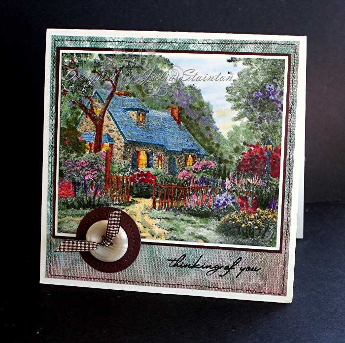
For this card design, I stamped my Foxglove cottage onto some Very Vanilla cardstock with my Black Palette Hybrid ink. I then worked carefully on the design. The best way to color this image is start really light and build up. By this I mean, color in all the greens with a light green color, the pinks the same, etc. Then come back and build up the color with darker markers where you need to deepen the shadows etc. For the flowers and foliage, I used a dabbing style of adding the color to get a more natural look instead of flat color. Think impressionist style here…it really works well for these images. At the point of coloring this image, I just had the 24B folder of Copics from Ellen’s store so my palette was limited. I can’t wait to try it out again with more range. Yay! My 24A has now arrived and I just have to find some free time!

For my card base design, I used a 5.5″ square card base in Very Vanilla cardstock and layered it with this Daisy D’s paper. The edges were stitched for definition in brown thread. After matting the image with chocolate chip and very vanilla cardstock narrow mats, I searched for an appropriate embellishment. I decided to add a simple, homey touch. A large button from My Mind’s Eye (they carry the most darling little jars!) was tied with some brown gingham ribbon. Note to self…go buy more at Wal-mart! It may be difficult to see in the photo (you can enlarge by clicking on it) but I punched a chocolate chip cardstock circle with my EKSuccess circle punch and then stitched around it with my sewing machine. The thinking of you sentiment…comes from one of my favorite sentiment sets… Simply Sentiments by Lizzie Anne Designs.

Edited to answer…. This design took me approximately an hour to color in. I know it seems like a lot but if you factor in that I really hadn’t had much practice with the Copics and I was making this design for a Craft Critique article and knew I needed to have a good end-product, it wasn’t too bad. From what I know now… I’m sure I could cut that time by half, easily. I know that I want to do this again soon. So when I do…I’ll time it for you. 🙂

Hope you enjoyed this design as much as I did. It was fun trying a different style of coloring with those Copic markers. I think the more I use them, the better I’ll understand their capabilities. Have a great week! It is going to be a busy one here. Lots to share so stop back in! 🙂

Smile…a Digital Layout

I’ve been so busy, I’ve totally forgotten to upload some of my digital designs! Actually I have a lot of designs queued up for posting, part of the problem is the time it takes to blog them all. The previous week, I was posting two entries a day and I’ll probably do that again this coming week, but right now, I’m spinning. So… no C’est Bon entry this Sunday as I just can’t do it. Sorry. 🙁

I’m hoping this digital layout will make you smile. This is my youngest little guy, Joshua this past summer. He is at the beach, actually on top of his father’s shoulders and just enjoying himself to the fullest.

Smiles

jks-smiles-joshua-digi-design-resized.jpg

The digital elements for this design were all part of the down loadable kit that came with the Ultimate Guide to Digital Scrapbooking. This was a fantastic publication put out by Better Homes and Gardens….fabulous for the beginner and full of extra techniques and ideas for those who wanted to take it up a notch. The kits contains great digital papers and embellishments and I put together this design using a few of them in Photoshop Elements 5.0 This is a fabulous program for the money. Lots of cool effects. Hmmm…just talking about it makes me want to find some time to do some more. There is never enough time in the day, is there?! If you are interested into getting into digital scrapbooking it is super fun. There are loads of free digi downloads out there if you are just wanting to try it out. I’d also recommend picking up that magazine if you have a chance…it is well worth the money. If you are interested and missed my Craft Critique article, you can check it out at The Ultimate Guide to Digital Scrapbooking: A Book Review

Hope you are enjoying your Sunday! {{{{Hugs}}}}

Simple Saturday – another holiday design…

Simple Saturdays and simple holidays…scrappin style. I’ve been having fun with a scrappin style of cardmaking lately. I’m always trying out new things. They are fun and it is good to stretch your design box a little.

Red Christmas Tree Design

jks-red-christmas-trees.jpg

I just love this Stamping Up Cherise paper…same designs as Charbon. I’m not usually a red person so this was fun to create. Love the red paired up with ivory…gives a little different slant than the usual red and white candy cane look. The trees were created by making long rectangles, finding the middle point and then trimming on an angle. I sponged the edges with Real Red classic ink and added cute buttons from My Mind’s Eye to the top. I was going to tie them but couldn’t find a matching ribbon. I actually think they look ok without…kind of goes well with the simple homespun look. My sentiment is from the beautiful Peace set from Flourishes. I quickly stamped it onto some vanilla cardstock, sponged the edges and stapled it to my card. A quick fun card and one that would be very easy to mass produce for the holidays.

Hope you are enjoying this beautiful Autumn Saturday. I’m off to help out with the renovation…this project is going to be huge! Sigh….but I can’t wait until it is done! 🙂

Ooh La La – a sunny color combo…

It’s hot again…well, hot for September in Ontario. We always get this Fall/Summer weather swing happening here for a few weeks. You never know quite what is about to happen next. And so… I thought I’d try out this warm color combo that is very much out of my normal color range…. Barely Banana, Pumpkin Pie and Very Vanilla. I saw this Nina Ricci perfume box set in the drug store the other day I was there. I think it was L’air du Temps and it looked very fun, artsy and very French and I thought…hmmm….what about trying that with my new Ooh La La stamp set from Lizzie Anne Designs? Can you tell?! I just LOVE this set! 🙂

Sunny Ooh La La 

jks-yellow-and-pumpking-ooh-la-la.jpg

I decided to keep this design clean and simple. I didn’t even color the images. That’s OK! Sometimes you don’t have to! I stamped the fun little images onto squares of very vanilla cardstock and then sponged the edges with So Saffron. The main layer is stamped with a little background print from the set in So Saffron onto Barely Banana cardstock. For the little strip panel, I used the long fun stamps from the set and stamped them in Pumpkin Pie. All my layers were matted with a very thin 1/8″ larger mat in Pumpkin Pie cardstock.

Quick Tip: When using rubber unmounted cling stamps or clear polymer stamps, apply more than one stamp at a time to your clear block to save time. This is great for lining up words for phrases or in this case, I stamped the long stamps on the horizontal strip at the same time.

For my embellishments I had fun using some items I’ve had around for a while. I couldn’t resist this dotted orange ribbon from Michael’s…in small amounts it is just darling and adds a little kick. This gorgeous Prima flower has been on my desk for I don’t know how long. I really need to use these colors more often! For the flower center, I used this darling little yellow dotted Making Memories brad and then added 3 little black brads at the top left to balance the design and add a little black to pop and match up the black in.

A little sketch for you…

jks-sunny-ooh-la-la-sketch.png

Click on the sketch to view larger. For more sketches, click on the Julia’s Sketches category under the entry title. 🙂

Wishing you all a super sunny September weekend! 🙂

Sooooooooooo……….

What do you think? I gave my banner a make-over. LOL I think I need one too! It was lots of fun to create with some digital kits I’ve purchased for some of my digi designs. Speaking of which… I haven’t shared any lately! I’ll have to do that soon!

Edited to add… A digital kit is a digital scrapbooking kit. This one is from Two Peas, a Rhonna Farrer kit…beautiful. I used the different elements and designed it with some other extras in my Photoshop Elements 5.0. yes…it does have a learning curve but it is so much fun! I learned so much while writing a review on the Ultimate Guide to Digital Scrapbooking for Craft Critique.com One reader mentioned it took longer than usual for my page to load. This happened to me the first time and now is fine. Cookies maybe?  I think that new changes to a site load slower? Really, I have no idea but it is the same pixel size as the other banner…that is set in stone with this template…so it should load the same.

Have a great evening!

Basic Gray – a charcoal challenge

The Way’s to Use it Challenge started off with a Going Grey challenge. How’s that for a little bit of history. There was a thread in SCS General Forums about how Going Gray was never used and I thought it would be a cool challenge…finding ways to use it. Thursday at that point (March 2005 – wow doesn’t seem like that long ago!) had no challenge and so I found myself with a fun hostess job. 🙂

I’ve been loving this new Stampin Up color Basic Gray…I’d been saying for quite a while it was a shame there wasn’t a great gray color in the palette and so I was excited to see it released this July. I think it is such and elegant color. BUT…. I’ve been forgetting to use it! And so, today’s challenge is to find Way’s to Use Basic Gray – not the Basic Grey patterned paper, but the new charcoal color. Of course, if you don’t have the Stampin Up paper…that’s OK! Just use something else by another company. Bazzill Basics has a beautiful Charcoal Gray as well and I do believe there may be a textured charcoal patterned paper in the new Periphery Line by Basic Grey. Check out the challenge at WT132

Happily Ever After

jks-happily-ever-after.jpg

I designed this card as part of an article review for Craft Critique on the new Thomas Kinkade stamps. I knew I’d love them but I found I just couldn’t put them down! I thought it would be great to experiment with the different inks and coloring techniques you could use with these stamps. I’ve heard some people are intimidated by them and I just had to see what worked, what didn’t and if they REALLY were hard to work with. NO! They aren’t! I loved them and found them to be easy to color depending on the technique of course. Cornish Heritage Farms has done an excellent job translating the painting into a detailed image and the stamps, pretty much shade themselves.

I also loved using a monochromatic look for these images. Beautiful in just a shade of ink, I had to try out my Tsukineko silver Brilliance Ink to see how it would turn out. Gorgeous and so easy. The Brilliance ink is a hybrid ink which worked well. I stamped it onto a piece of my Basic Gray cardstock and after allowing to dry, trimmed it to size.

Quick Tip: Make sure you use Hybrid ink or classic ink on detailed images. The Craft ink will just be too thick and gummy to get a great print.

I loved the elegant look and decided to pair it up with my SU Charbon patterned paper. I just adore this paper and the ivory and charcoal color combo is beautiful together. I never would have thought to put these two colors together but I decided I must use them more often! I used a 5.5″ square card base so that I would have lots of room for the large stamp image. The layout design was kept simple because of the busy patterns and the small amount of room to work with.

To embellish the design, I used some of my new May Arts ivory scalloped satin ribbon as a photo corner embellishment. I threaded it through the swirl clip from the SU hodgepodge hardware set and then adhered on the back of the image. The two ivory Prima Flowers are from the Got Flowers Winter Mix bottle and are attached to the image front with my Karen Foster Thumbtack Brads. Inside the design, I computer generated a sentiment.. Happily Ever After…Congratulations on your marriage…happiness always! I just love how this elegant image works for a lot of occasions.

Hope you can join us for the Charcoal Challenge today! Have a great Thursday!

Supply List:

Cardstock: Very Vanilla, Basic Gray – Stampin Up

Patterned Paper: charbon – SU

Stamps: Foxglove Cottage by Fhoms Kinkade – Cornish Heritage Farms

Ink: Silver Brilliance Ink – Tsukineko

Other; ivory ribbon – May Arts, Thumbtack brads “metal” – Karen Foster Design, Prima flowers, hodgepodge hardware – SU

Group Hug…

They arrived today! I’m so excited! I just want to give everyone a big huge group hug! LOL I designed this snowman group hug stamp last year in October and yay! it is finally in production. This group of snowmen just popped into my mind and reminds me of some of my fabulous stamping buddies. A big great group hug to you, my friends! Stamping Bella just released this stamp about a week ago and my mailperson slid it in my box this morning. I just couldn’t resist pairing it up with today’s sketch challenge…never mind that I have a million others things I really SHOULD be doing! There is always time for a hug, right?!

Warm Hugs

jks-group-hug.jpg

I know this card takes a few liberties with today’s sketch challenge. I was really trying to make it work for this stamp! I paired it up with this darling Adorn It paper I’d picked up at the Scrapbook Studio the other week. Sooo cute! I knew I wanted to use my favorite Soft Sky cardstock on this design so I pulled the Blue Bayou color out of the paper as well as Kraft to make it work.

The snowmen are colored with my new Copic Markers. Yay! My other set arrived safely and I just love the new colors. How did I survive without that soft, soft grey for shading?! A little sponging, a little stitching and some fun embellishments finish off the card. Another ultra soft velvet brad from Making memories and a Heidi Swapp ghost shapes snowflake and it was done. 🙂

Wishing you are warm fuzzy group hug kind of day!