Monthly Archives: July 2007

You’re a Star!

OK….I’m almost done with this Text Boxed stamp set….for a while anyways! šŸ˜‰ I KNOW I’m going to pull this one out a lot in the future as well. I wanted to give the star image in this set a whirl. When I think of stars, I think of wishing and dreaming and so I thought this would make a neat graduation design. I had to show you two different photos. One to get the shine of the ink and the other to get the idea of the see-through vellum window. Now that I think of it, this design could be altered for anyone. After all….a girl’s got to have dreams, right?!

Starry Dream

jks-starry-dream-2.jpg

To create this card, I started off with a top hinged 4.25 x 5.5″ black card base. I first stamped the faux ribbons across the design in Gold Brilliance ink. To plan the window, IĀ then stamped my box onto the black cardstock. After stamping, I took my Perfect Layers tool and lined up the1/4″ mark with the edge of the stamping. I carefully cut a 1/4″ larger window out in this manner. ( I then discarded the black cut-out stamped box)

Quick Tip: Brilliance Inks by Tsukineko work great and dry quickly on vellum and cardstock.

On a generous piece of cardstock vellum, I then stamped the reverse star image again. I carefully trimmed a 1/2″ border around the image with my perfect layers tool. Using my xacto knife again, I cut out the stars for a peek-a-boo inside effect. The sentiment was then stamped onto the panel as well so that it would show up as part of the main detail.

To put it all together, I lined up my vellum over my window making sure all the borders were equal. I then stitched the vellum panel on top with my sewing machine. To finish it off, I stamped a trail of stars onto the black card. I had so much fun designing this card. I love the way the vellum window lights up when it is displayed. It is always great when you try something a little out of the box and it works! šŸ™‚

jks-starry-dream.jpg

SupplyĀ List:

Cardstock: Basic Black, Vellum – Stampin Up

Stamps: Text Boxed, Faux Ribbon – Papertrey Ink

Ink: Gold Brilliance, Black StazonĀ – Tsukineko

Other: Sewing machine, x-acto knife, Perfect Layers

Color Challenge…Just had to play!

I wasn’t planning on playing along today…so many things to do! I just had to take a break though and play with some of my new SU stamps that arrived yesterday! I’ve been wanting to try out this new Wanted set and the color challenge seemed perfect for it so here I am! šŸ™‚

Wanted Birthday

jks-wanted-birthday.jpg

Two guy cards in one day! LOL What are the odds of that?! Love this color combo…Mellow Moss, Not Quite Navy, Bordering Blue! I added a little mat of Very Vanilla and some Close to Cocoa sponging and pretty much what you see is what you get! I love this new set…the little stamps that go with it are SO flexible. Perfect for layers and backgrounds! I didn’t even use any patterned paper on this design.

Hope you enjoy it! I’ll be trying to work in some of my new designs over the next few days. šŸ™‚

Supply List:

Cardstock: Mellow Moss, Not Quite Navy, Very Vanilla, Bordering Blue – SU

Stamps: Wanted, It’s Your Birthday – SU

Ink: Mellow Moss, Not Quite Navy, Close to Cocoa – SU

Other: edge distresser – Heidi Swapp, circle charm – K & Company (retired), Hodgepodge Hardware – SU

Another Birthday…

So many birthdays in the house when you have a large family! My son David turned twelve last week! Can’t believe how fast the time flies by! I had made a different card for his birthday but my oldest son, told me it was wayyyy too young for him so I had to try again. I’m thinking this one turned out a little old but hey…he seemed to like it! Sigh…. they get grown-up, wayĀ  too quickly!

Starfish Birthday (click on pic to enlarge)

jks-starfisth-birthday.jpg

I pulled the color scheme of this card from some of my Scarlet’s Letter patterned paper from Basic Grey. I was digging through my stash, looking for some inspiration…not too much paper that works for masculine designs in there! When I found this Basic Grey paper, I was thrilled because it really works well! Distressed look, stripes, great masculine colors!

To create this design, I started off with a 5″ square card baseĀ of Buckaroo Blue (one of the 2006 SU In Colors) and layered it with the striped paper and a black mat. I just love acetate layers…they work on any card but especially well on masuline designs. I stamped the acetate sheet with my Black Stazon and the swirly starfish from Shore Thoughts by Lizzie Anne Designs. To attach it to my design, I decided to try out a different idea and to hand stitch it to my card base. I punched tiny holes into the cardstock using my paper piercer and mat pack and then stitched through them with linen thread. I love the contrast in textures this adds and it gives a subtle photo-corner look to frame the design.

For the main image, I stamped one of the shells stamps in Bordering Blue and then the sentiment. After sponging the edges, I matted the image and attached two little brads for embellishment.

David with his Ice Cream Cake

jks-david-with-cake.jpg

Now I haven’t forgotten that I promised train photos from Friday. I’ve been so swamped here that I haven’t been able to edit or resize them….but they are coming! šŸ™‚ We had a wonderful day.

Wagon of Flowers…

I just adore flowers…. You probably already know that by the amount of floral images you see in my designs. They are just so versatile, how can you resist flower stamps? I always think I have enough but, you know…. something really cute comes along and it somehow makes its way into my collection! šŸ™‚

Thinking of You Floral Wheelbarrow

jks-flowers-and-wagon-thinking-of-you.jpg

This little Floral Wheelbarrow stamp is from Gina K Designs. It is so cute, I just had to try it out with a shabby, warm soft of look. Because I’ve been working on so many blue or beach-themed designs, the pink floral was a fun change. I wanted to pair up this image with my Daisy D’s patterned paper…I’ve been using so much of this line…it is so flexible and easy to use! It is 12×12 paper but the scale is small and perfect for card designs!

For this design, I started out with my 5″ square kraft base and layered it with squares of the patterned paper. To add to my shabby look and define the edges, I sanded the edges of the floral paper. I love sanding paper! I also added a row of zig zag stitching to the top of my design. I used a printed twill ribbon for my sentiment and attached it at both ends withe eyelets set with my Crop-a-dile.

My main image is stamped onto Whisper White cardstock with Palette Noir ink. After watercoloring with my aquapainter and allowing to dry well, I sponged the edges with Close to Cocoa ink and adered these darling little pearls from Ellen Hutson for the flower centers. The final touch was to add a little piece of Hodgepodge Hardware to the top of the image and tie on a ribbon. I love Hodgepodge Hardware and purchased two sets of it two years ago. It REALLY does last a long time, even when you make as many projects as I do. I’m down to my least favorite pieces of the sets and now my goal is to find ways to use it up! šŸ™‚ Hopefully I’ll be coming up with some new ways to use it over the next weeks.

Quick Tip: To keep loose hardware from shifting onĀ  your design, apply a mini glue dot to the back before you attach with a brad. This works well for photo anchors or larger pieces.

Supply List:

Cardstock: Kraft, Whisper White

Patterned Paper: Daisy D’s

Stamps: Flower Wagon – Gina K Designs

Ink: Close to Cocoa, Regal Rose, Certainly Celery – Stampin Up, Palette Noir – Stewart Superior

Other: Hodgepodge Hardware, ribbonĀ – Stampin Up, sewing machine, twill ribbon – Creative Impressions, pink pearl stickers, eyelets – Making Memories, Crop-a-dile – We R Memory Keepers

Palette Hybrid Ink {C’est Bon}

jks-palette-inks.jpg
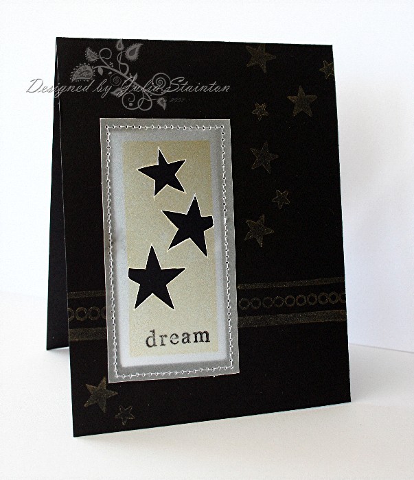
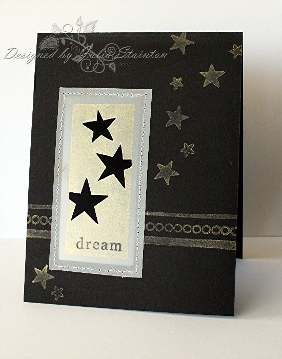
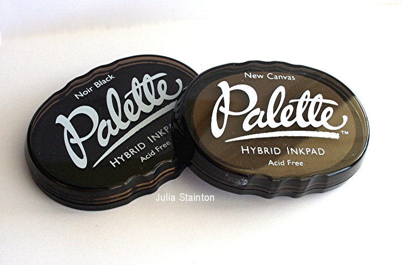
I just love my new Palette Hybrid ink pads by Stewart Superior.Ā  They are so versatileĀ and easy to use! I currently own just the Black and the Canvas ( a soft white) but that Burnt Umber is on its way! I think I’ll be trying out those little colored cubes soon too!

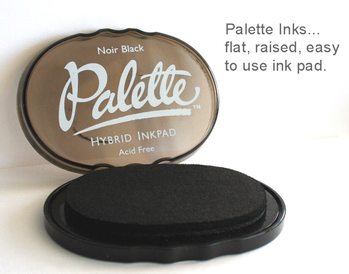
The Palette Hybrid inks are the brainchild of Stewart Superior and are a fabulous formula of the best of many types of inks…thus the hybrid name. The black I’ve been using for the past couple years is great, but the with the design of the container, the felt actually sags in the middle making it SO difficult to evenly ink up a large, detailed stamp. I love the flat, raised surface of my new Palette Noir pad…it always works perfectly. Another great thing is the great, clean impression you get with it and it doesn’t bleed when you want to watercolor the image. The Canvas is a great soft white and my new favorite white. Believe me when I tell you have had a hit and miss time with whites. I love this one!

jks-palette-inks-open.jpg

Great things about these ink pads…

  • great for scrapbooking: acid-free, archival & non-fading
  • raised flat surface: so easy to ink a stamp or part of one
  • waterproof ink!
  • Works great on paper, vellum, fabric, glossy
  • Dries instantly on paper…heat set on glossy or fabric
  • non-solvent ink – doesn’t smell or dry out too quickly
  • Canvas is a great matte white ink, not gummy like a Craft White
  • ink works fabulous on clear stamps as well as rubber
  • inks are easy to clean off stamps
  • easy to hold
  • ink pads all stack for easy storage
  • You can EVEN use it on glass, wood, plastic and metal! You just need to heat-set it!
  • If paired up with a watermark or embossing ink, you can still emboss with them.
  • lid snaps into base so that you don’t lose it šŸ™‚
  • You can buy ink refills for them so they are a great investment
  • very reasonable price for the flexibility you are getting!!!!

jks-palette-inks-raised.jpg

Where to Find Them…

I bought my ink pads from two different places. One on-line and another in person. Check them out below!

If you have questions about this product, I’ll do my best to answer them by editing in at the bottom of this entry. Have a fabulous day!
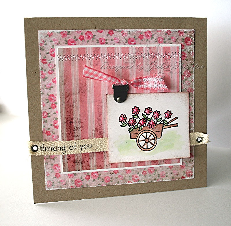
* * * * * * * * * * * *

Thankful Flowers

jks-thankful-flowers.jpg

I used my new Palette inks on this design…Black & Canvas. I love how they instantly dried and gave a crisp impression. For this design I also used some Apricot Appeal dye ink by Stampin Up and a Rose Red Stampin Up marker. I love this Papertrey Ink Text Boxed stamp set. For the main image, I inked it up with my Apricot ink pad and then went over the image detail with my Rose Red marker and then inked around the edges before stamping it onto some watercolor paper. I love the soft look and for large clear stamp, watercolor paper works really well to get an image.

After stamping my image, I distressed the edges with my edge distresser to play up on that texture of the watercolor paper. I also stamped out a little flower image, circle punched it and then matted it. Into the center, I inserted a little brad for definition.

For the rest of my design, I used a 5.25″ Rose Red square card base and layered it with the Apricot Appeal. After stamping the little dots from the set on another layer of Rose Red cardstock, I adhered it to my card front and then stitched around the outside of my design.

To finish off the design, I added a little scrap of dotted ribbon under the main image and adhered the design together. The little sentiment thankful is actually two stamps. Thank & ful. Love how they go together and you can also use the “ful” with “joy” from the same set. I love the crisp impression I get using the Palette Noir ink with my clear sentiments. I get a much better impression now. šŸ™‚

Supply list:

Cardstock: Rose Red, Appricot Appeal, Watercolor paper – Stampin Up

Stamps: Text Boxed – Papertrey Ink

Ink: Palette Noir, Palette Canvas – Stewart Superior – Apricot Appeal, Rose Red Marker – Stampin Up

Other: sewing machine, edge distresser – Heidi Swapp, ribbon – Michael’s, brad – Making Memories

Edited to Answer…

Zanne asked : Looking at color, it is a faded shade, as if pad needed ink. Could pad have dried out? Are there reinkers?

That’s too bad! Mine is great! It sounds to me like it needs to be reinked. Yes, there are reinkers available. Ellen Hutson sells them. If I were you though, I’d take it back to where you bought it and inquire. You could also e-mail the company and ask them. There is a link to their site at the top of this post. If you do….please let me know what they say. I’d love to know about it and their customer service.

Twinks said: Did you reink yours to start as well? Love the Stazon Opague Wite but that came with the reinker and a dry pad so iā€™m curious about who often one would have to reink the pads. iā€™m getting nice clean lines but thin lines. Do you suggest reinking?

I didn’t have to reink either of my pads to start. I have ordered the reinkers though as they have been getting a lot of use. If you have the reinker, I don’t think it would hurt to reink it to see the difference. This pad does have a lighter white look than the stazon, it is not so gummy. I was pleased how clean the image was though and how the drying time was immediate. I am in really short supply of stamping time right now! šŸ™‚

Simply Saturday…another design

I like Saturday designs to be quick and easy. It is always a nice break for a busy day and really, you don’t need complex designs every card you create! I decided to use this little dress stamp from A Muse for today’s design. It is so cute and flirty and paired up with a little Tres Jolie paper from My Mind’s Eye, it is all you need!

Dotted Dress Design

jks-dotted-dress.jpg

I found a few scraps of this Tres Jolie paper and put them to good use. The polka dots were the perfect scale for this little dress. A larger pattern would have been overwhelming. I also used lots of empty design space in the image box to keep it nice and clean. Empty space can work well in a design, just don’t be afraid to use it.

To create this design, simply stamp your image onto the vanilla paper and then onto the patterned paper. Trim out the patterned dress carefully and adhere on top of design on cardstock. Stamp sentiment and mat image layer. The striped paper was then trimmed to fit and the edge scalloped with my small corner rounder. Adhere striped paper and punch with crop-a-dile. I also shortened the front panel by 1/2″ so that the back panel peeks out at the side. šŸ™‚ A little Prima and brad finish it off! Quick and cute!

Supply List:

Cardstock: Soft Sky, Very Vanilla, Blue – Stampin up

Patterned Paper: Tres Jolie line – My Mind’s Eye

Stamps: A Muse Art Stamps, Simply Sentiments – Lizzie Anne Designs

Ink: Palette Noir – Stewart Superior

Other; Brad – Making Memories, small corner round – EK Success, Prima flower, Crop-a-dile – We R Memory Keepers

Shore Thoughts…

I just can’t seem to put this Shore Thoughts stamp set down! Love it! Depending on which stamps of the set you use, you can get a great range of styles from it…masculine, feminine, streamlined, fanciful…so much fun! If you checked out Craft Critique yesterday, you may have seen this design as part of my Altered Ribbon article there. (If you missed it and want the link, you can find it in my tutorials section in the sidebar). I love ribbon and I think this dotted brown organdy is one of my faves.

This morning,Ā myĀ aunt and IĀ are off for a fun day with the kids. When Benjamin had the chicken pox, he missed his school trip which was a vintage train ride from a little town on Lake Erie. We told him we’d all go so that he wasn’t so upset and today is the day. It is gorgeous here…perfect for it! Sunny and warm but not hot. I can’t wait to see the expressions on my two littlest boys’ faces. I’ll have to take some pics to share!

Retro Shells

jks-retro-shells.jpg

I love this paper by Daisy D’s….Playtime Stripe. It has such a great retro/vintage feel to it with the colors and distressed look. I decided to try pairing it up with my Shore Thoughts stamp set and the heated organdy ribbon technique and see what I could come up with.

This card is pretty straight-forward. Simple stamping for the image. i decided to stamp on a larger piece of whisper white cardstock and off-set the image. It is always an interesting look and I so often get into the rut of closely cropping my images. This way allows room for a sentiment and a layer or extra embellishments on top.

Quick Tip: For an easy color scheme, pull your colors from some patterned paper.

One my design was all adhered together, I clipped on a circle clip from my Hodgepodge Hardware set and tied on some of my dotted organdy ribbon. To give it a distressed look, I took my heat gun and lightly applied heat in short bursts to the ribbon until I got the shriveled look I wanted. If you’ve never tried this, it is a great, fast technique but yo umay want to practice firstĀ Be carefulĀ as overheating will melt your ribbon. šŸ™ For this card, I actually did FAUX stitching for a change! You know how much I love my sewing machine but I thought for a change, I’d give faux a little try.

Wishing you all a fabulous day and weekend!

Supply List:

Cardstock: Chocolate Chip, Whisper White, Ruby Red – Stampin Up

Patterned Paper: Playtime Stripe – Daisy D’s

Stamps: Shore Thoughts, Simply Sentiments – Lizzie Anne Designs

Ink: Black, Close to Cocoa, Soft Sky, Ruby Red – Stampin Up

Other: Hodgepodge Hardware, Mat packĀ – Stampin Up, ribbon – Michael’s, circle punches – EK Success