Daily Archives: July 30, 2007

A Distressing Challenge

Well, the challenge itself isn’t getting me distressed…I love it! The challenge IS to USE distressing techniques. 🙂 When I saw that Michele was doing a distressing challenge for one of today’s DTGD challenges, I just had to make a card. I LOVE distressing! Now for this design, I kept it pretty light on the distressing. I didn’t want it to overwhelm of the vintage baby look…but it is there! Distressed edges and lots of light sponging. 🙂 If you want to play along, check out today’s challenges here!

Vintage Baby Girl

jks-vintage-baby-girl.jpg

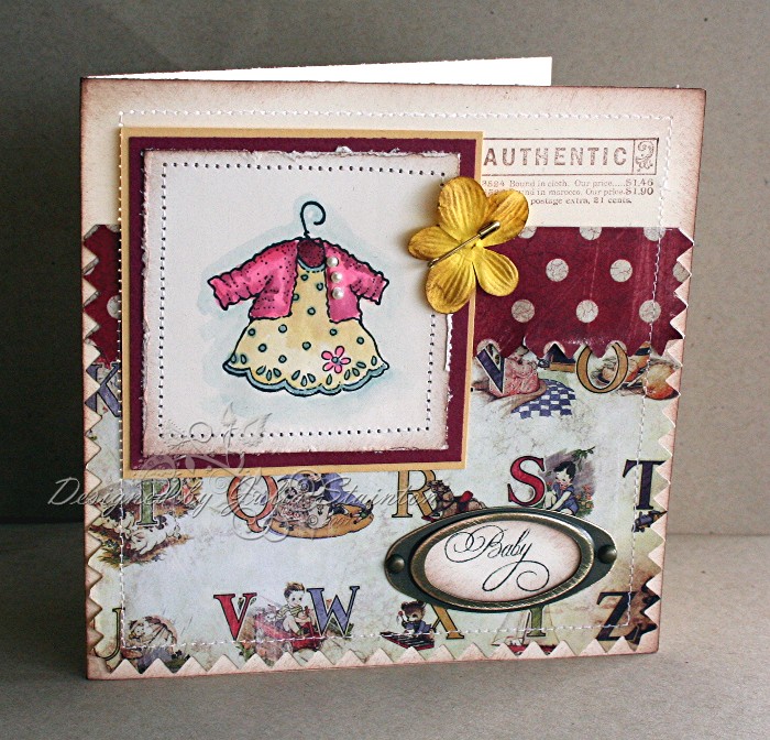
I was so excited to get this Stampendous stamp last Friday from Anna Wight. (Actually I just checked her store and she is all out but if you e-mail her, she will order it in.)  I just LOVE it! I’m hoping that lots of people will be having lots of little girls so that I can keep using it. It is soooo sweet! I couldn’t wait to pair it up with this darling Daisy d’s swatch paper. i just love the pre-pinked edges and designed the card to play up on this feature.

To make the main part of this design, I used 5.5 ” square card base of Very Vanilla and sponged the edges with Close to Cocoa ink. I folded over the top 1/4 of the paper to show the reverse side and break up the design without cutting off the very cute pinked top edge. The edges were then stitched around with my sewing machine and I lightly distressed the pinked edge by running my finger along to pull up some of the edge. I then stamped Authentic from my SU Stamp of Authenticity Set at the top right corner.

For the main image, I stamped it on a scrap of Very Vanilla cardstock and watercolored the dress with my aquapainter and ink in the lids of my inkpads. To get depth while watercoloring, I usually start with a light color wash of the area and then add in darker details after that has dried a little but not all the way so it will still blend in a little. My favorite part of the dress is the little pearl buttons. I just love these little pearl stickers from Ellen Hutson! After sponging and distressing the edges of the image panel, I matted it with So Saffron and a piece of the Swatch Daisy D paper. I then added more stitching for definition and to add to the vintage look. If you like the look of stitching but are unsure of how to do it, check out my Sewing Tutorial that I wrote a few months ago for tips. 🙂

For the sentiment, I used my new Flourished Words stamp set. I just love these sentiments! I punched it out with my SU oval punch and then framed with with some Hodgepodge Hardware that had been distressed by sanding the metal finish. My final touch was a sponged yellow Prima flower, I believe from the Baby Girl Collection, which I pinned with a safety pin and then adhered to the design.

I love this card. I’m keeping it in a very safe place as my husband’s brother and wife have a special little bundle on the way. If it is a girl, she’ll be getting this card. 🙂

Supply List:

Cardstock: So Saffron, Very Vanilla – SU

Patterned Paper: Daisy D’s

Stamps: Baby Dress – Stampendous, Flourished Words – Flourishes,

Some more Q & A

I remembered again and it is time for some more answers to those questions this morning. I’ll also be back at noon with an entry for the Dare to Get Dirty Challenges. 🙂 I can’t wait to share this design. 🙂

Liane asked : I am relatively new to stamping and would like to ask a question regarding using large stamps . I frequently seem to have a problem getting the middle of the stamp to make a clear immpression ?? suggestions ? thanks again Liane

This is a good question Liane and one I had a lot of trouble with when starting stamping! If you are working with medium sized stamps a good hint is to put a few sheets of paper under your surface. This “gives” a little and helps get a more even impression for the whole surface.

If you are working with large full-card size background stamps, I also have a few hints. Turn your stamp upside down! Lay the paper on top of that and press evenly across paper with your hand or a clean brayer. I usually layer a scrap paper on top of the stamp/cardstock to keep my hand or brayer clean if it doesn’t quite cover the whole stamp. If you are having trouble inking the stamp surface evenly, rolling the ink on with a brayer is a good way to handle that. Hope this helps!

LTanoe asked: How does the new “in thing”/must have, for you, in stamping come to be? For awhile everyone raved about chalk inks, prismacolor pencils, Versa this and that and now, Palette inks and copic markers. If you have all of these in addition to watercolor pencils, crayons, craft ink – how do you display them to really use them as your tools or how do you decide what medium you will use on your creation/ (more than one question) Thanks.

Well….this is a bit of a tough question! LOL It is mostly a matter of personal preference as to which inks or means of coloring you use. Many times the product will be dictated by the technique or look you are trying to achieve. As for storage…that is always an on-going issue! I never had enough. Basically…I’ll tell you what I use the most and you can decide what is best for you. 🙂 I keep all my SU classic ink pads on my desk…I’m using those daily! Most of the time…about 95%… an aquapainter and my classic ink pads are what I use for stamping and coloring. Now my new Copic Markers should be here soon and soooo….that COULD change! LOL

I do love the new Palette Hybrid inks and highly recommend them. Actually I’m thinking of totally tossing my SU black because it just sits there now.  Chalk inks…I love the Versafine ones and have them in a little dish as I just don’t have many of them yet. They are great for clear stamps and vellum and are really nice to have but I could live without them if I HAD to.

Craft ink…I bought in the SU Spots so that they would store easily as I don’t’ use them very often…mostly just for embossing or special projects. Watercolor pencils…I hate them. LOL Watercolor crayons…these are nice but I rarely use them…they stay in the drawer. Prismacolor Pencils and gamsol…love this look but rarely use it. I’ve got 5 kids here at home and anything I make has to be pretty fast!

Kerrie said:  I have more questions than any one person should have…I always wonder how people find their inspiration to create such beautiful work?  What companies do you find to have the best pattern paper, colors etc. that you just know will inspire you, how do you decide when enough is enough…

Yes…how DO you know when enough is enough? Please tell ME as I don’t know that!  Basically, I get a lot of inspiration from the world around me, the patterned paper I use, magazines, billboards, scrapbook magazines, displays in the mall. I’ve been known to scribble color combos or layouts on the back of receipts at the mall. I think perhaps the best thing to do is design every day. That keeps your mind looking for new ideas. Recently I went out to lunch at a lovely restaurant. They divided up the space with beautiful frosted glass panels with leaves. I kept looking at it thinking it would make a beautiful stamped design.

As for companies of patterned paper….I love many! Basic Grey, Daisy D’s, Fancy Pants, Cosmo Cricket and My Mind’s Eye are my current faves. There are so many to choose from!