Category Archives: Tutorials & Techniques

Simply Saturday…simply soldered

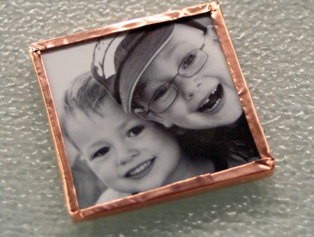
Really. It’s not that hard. It’s actually pretty simple. Just start with a simple project such as a photo and get soldering! I created this quick pendant with a photo of two of my boys on it. You’ve probably seen the photo before as I’ve used it on a couple layouts. If you’ve always wanted to try soldering…why not now? There’s time to put together a few fun projects for Christmas gifts!

Soldered Photo Charm

jks-soldered-photo.jpg

Here’s how to go about it!

Soldering your project is really quite easy to do and just takes a little practice. Create your art the size of the glass slides you intend to use and then sandwich it between the two pieces. As you can see both sides of the design, don’t forget to add art to both front and back. Carefully wrap the edges with your copper foil tape and fold side edges over the glass on both the front and back sides. Fold corners neatly and burnish the foil to the glass to remove wrinkles and produce a secure frame. Hold your project with clamps provided as it will be too hot for your fingers. You will also need a heat-proof work surface. You can purchase a heat mat, use a large tile or as I do, use a glass cutting board. You don’t want small bits of molten solder ruining a beautiful counter or desktop. Plug in your soldering iron and heat well. Before adding solder, paint the copper foil tape edges with flux to help the solder spread evenly across your surface. Hold the solder to the top of your soldering iron to melt solder and then touch top of iron to copper surface. This will allow the solder to flow onto your copper. Lift the soldering iron up a little and move soldering iron along to allow solder to flow down onto the surface. It is best to apply small amounts of solder at a time. You can always go back and add more coats for a smooth beautiful finish.

jks-soldered-photo-supply-p.jpg

jks-soldered-photo-copper-s.jpg

jks-soldered-photo-flux.jpg

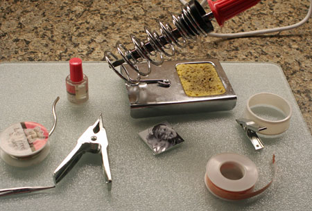
Sorry I don’t have a photo of the actual soldering but that would require more hands than I have!

Want more soldering ideas? Simply type solder in my search feature. 🙂 Part of today’s entry was part of a Craft Critique review here.

Have a simply wonderful Saturday!

a-signature-2.jpg

Shakin’ it up

jks-holiday-shaker-close.jpg

Today I’m shaking it up a little with a fun holiday shaker card! If you’ve never made a shaker card, they are fun and easy. Yes…they do take a little more time than some designs but they are so worth it. For this design, I filled my shaker with a fun new product from Art Institute…Faux Snow. These soft iridescent flakes have so many uses and are the product spotlight at Cornish Heritage Farms this week. Now I don’t know about the weather were you live, but the snow flakes are pretty much ready to start flying here in Ontario. The weather has definitely taken a turn for the colder. I thought it would make a fun challenge for this week’s Challenge Chicks Challenge to use faux snow on the designs. Whether you use Faux Snow from Art Institute, create some snow with Liquid Applique, glitter, etc., let those flurries fly and show us how you like to create snow in your designs. Check out the challenge here!

As always…some of the other designers have played along with this challenge. Check out their super-cool designs too…. Kristine, Michele, Dawn, Julie, Jennifer & Lesley

Holiday Shaker Card

jks-holiday-shaker-card.jpg

To create a shaker card, you’ll need a clear transparency for the window. I love using the Clear Card Sheets as they are so thick, crisp and professional.To create my window, I ran two Nestability dies through my die cut machine together with my white cardstock. They are so thin and the straight smaller square will nest perfectly in the larger scalloped square. To add my embossing, I simply removed the smaller square and then ran the scalloped die with my die cut cardstock through the machine with my embossing mat. To get enough dimension to the product so that my flakes with shake ;), I used foam adhesive strips between the layers.

Thanks for stopping by! Have a wonderful week!

a-signature-2.jpg

Supply List:

Stamps:
Heart Warmers (Kim Hughes line) by Cornish Heritage Farms

Ink:
-Black Stazon by Tsukineko

Paper:
-Spring Willow Light, Simply Smooth White by Prism
-Making Memories patterned paper

Other:
-Clear Card Sheet by Cornish Heritage Farms
-Nestabilities dies by Spellbinders
-buttons by Autumn Leaves
-sewing machine
-Faux Snow by Art Institute
-ribbon by Creative Impressions

Cardboard anyone?

jks-girly-close.jpg

I just love the look of this new Fine Lines Backgrounder stamped on Kraft cardstock. Does it not look like faux cardboard? I decided to try a quick masking technique to make a fun faux torn cardboard edge on my layer. By simply tearing a piece of scrap cardstock and then using it to mask the top area while I stamped the backgrounder and then sponged to create a shadow, I gave this card a bit more dimension without adding another layer.

I’ve also been having fun making my own custom embellishments using this darling butterfly stamp from one of Kim Hughes’ new releases. Simply stamp onto a Clear Card Sheet using Black Stazon (one of those must-have inks IMHO) and you can make all the custom butterflies you wish!

Girly

jks-girly.jpg

Quick Tip: When using clear embellishments…layer them over other items such as flowers, ribbon etc. to highlight their clear properties.

Wishing you a fabulous day!

a-signature-2.jpg

Supply List:

Stamps:
-Little Gal (Kim Hughes line) by Cornish Heritage Farms
-Fine Lines Backgrounder by Cornish Heritage Farms

Ink:
-Burnt Umber and Black Palette ink by Stewart Superior
-Walnut Stain Distress ink by Ranger
=Black Stazon by Tsukineko

Paper:
-Simply Smooth White cardstock by Prism
-Kraft Cardstock by Prism

Other:
-Clear Card Sheet by Cornish Heritage Farms
-stapler
-ribbon and flower by Prima Marketing
-rhinestones by MAMBI
-tape by Prima

Choosing a Color Combo…a short tutorial

Finding new and fresh color combos is a really easy thing to do if you just take the time to look around you. Color combos are everywhere from fashion, magazine advertisements, even your cereal box. One of my favorite places to find color inspiration is patterned paper. There are a wealth of colors and patterns out there presenting a never ending source of inspiration. Depending on how you change up your combo and the predominant color , a lot of looks that can be achieved from one piece of patterned paper. Very easy to do…I’ll show you how to put together some quick combos to try.

First of all, choose a piece of patterned paper that inspires you. It doesn’t matter whether you plan to use the paper in your final project or not. Sometimes I have created entire projects are a color scheme, planning to use the paper and then ended up not using it for more than a tiny scrap. I loved the wealth of color in this 12 x12 sheet of Crate paper (Flower from the Blue Hill Collection)
crate-paper.jpg

Simply go through with color swatches of cardstock and pull out the colors you want to use. Try lots of variations…it can totally change the look. Here is a few samples of what I came up with for this paper. I used my color picker to pull colors directly from the paper in Photoshop Elements. If you do it digitally, you still have to find cardstock that will be a close approximate to your color.


cc01.jpg

cc02.jpg

cc03.jpg

cc04.jpg

cc05.jpg

cc06.jpg

cc08.jpg

cc09.jpg

cc10.jpg

cc11.jpg

cc12.jpg


As you can see…I managed to easily pick out twelve 4-color combos. If I had decided to create 3-color combos…I could create even more variations. The paper I chose had fairly constant color values but some papers will have lots of graduations of the same you providing you with endless variations. Also look at the different combinations. I love seeing how just changing one color can change the look of the design. Some combos feel warmer, others cooler. Some vibrant, some subtle.

Quick Tip: One thing that I do when picking a color combo is to try and vary the intensity of the colors for balance. It can be quite overwhelming on a design if you use four dark deep colors. I like to throw in something a little lighter so give the eye some variation.

Feel like a challenge?…pick one of the above combos and create your own design OR pick a patterned paper and come up with your own combos. Have fun! If you decide to take up my challenge…be sure to link your project back here in my comments section…I’d love to see what you do!

Tomorrow I have a project to share with you that uses one of these combos. Which one? 🙂 Stay tuned.

Until then,

J

Inching along…and a tutorial

Who knew I’d like Inchies so much?! I just can’t seem to stop using them. My favorite idea so far though has been to stamp twelve of them with one large Thomas Kinkade image. When I got my new Hometown Pride image…I just had to try it out. Seriously…I love this image even if I’m Canadian. Hmmmm…do you think Thomas Kinkade could paint one with a Canadian Flag? Sigh….I think the odds are pretty slim. 🙁

For this design, I used half a CHF Clear Card Sheet for my card base…a little hard to see in the photo but yes…that is on a clear card. I can’t stop using those either so I thought I’d give it a whirl combining the two. 🙂 For this project I’ve written a step by step photo tutorial. You can check it out here.

Hometown Pride Clear Card Design

jks-hometown-pride-600.jpg

Thanks for stopping by! Have a super fabulous and safe weekend!

Julia

Frosted Hearts

I had someone suggest the other day that I post reruns on my blog while I’m busy with my huge to-do list and the renovation. Well, I’m probably not going to do that but I did remember that I haven’t posted any of my Cards publication designs. I thought I’d share this one with you today. This design is from the February 2008 Cards magazine…

Frosted Hearts

jks-frosted-hearts-cards-pu.jpg

I created this design with my hubby in mind. I just love this cool technique. I originally tried it out on a card design the last month I was on the SCS Dirty Dozen Design Team. The acrylic panel is from One Heart One Mind and I lightly sanded it with fine grit sandpaper. After sanding to achieve a frosted appearance…I stamped my hearts onto the acrylic surface with Versamark ink and then embossed with clear embossing powder. The embossing fills in the fine sanding and gives you a beautiful clear look. The patterened paper used to create this design is the beautiful Romantica Line from Prima Marketing. A simple layout and some stitching finish it off.

Wishing you a fabulous weekend!

Sweet Little One…

I’m back with a design I worked up this morning using a sneak peek at a new release from The Rummage Bin line from Cornish Heritage Farms. Lesley’s been hard at work and has two darling new stamps with a beautiful original look. I’m sharing this design with one of them today and have an altered project using the other one for tomorrow which is also the release day. 🙂 Want a few more sneak peeks…be sure to check out these blogs today as well…. Alli, Lori, Lesley, Lisa Silver, Lisa Strahl, Kristine & Sherrie. 🙂

Sweet Little One

jks-sweet-little-one-angle.jpg

This design was stamped onto white glossy cardstock using Burnt Umber Palette Ink. After trimming the image, I sponged the edges with Ranger Brushed Corduroy Distress ink. To get a photo tinted look, I used Ranger Cut N Dry nibs to pick up color from my ink pads and apply to the glossy paper. I love how the sentiment is included right onto the image stamp making it super easy. No need to work one in yourself. 🙂

To create my back ground, I stamped my Spanish Script Backgrounder onto pink cardstock and then added flourishes from Lesley’s Beautiful stamp set. A little more sponging and then I stitched the image panel down the right hand side.

For embellishments…some Prima Hydrangeas are topped with an Autumn Leaves button and tied with Creative Impressions ribbon. The sweet little felt bird silhouette is from Maya Road.

Quick Tip: Heat set your ink on the glossy cardstock to prevent smearing when adding in the dye color.

Also…if you’re looking for a gorgeous technique and project…check out Keri Sereika’s stunning tutorial.. Patterned Paper…or is it. 🙂 I’m speechless. 🙂

Stamps:
-Sweet One Collage(The Rummage Bin line) by Cornish Heritage Farms
-flourishes from Beautiful set (The Rummage Bin line) by Cornish Heritage Farms
-Spanish Script Backgrounder by Cornish Heritage Farms

Ink:
-Burnt Umber Palette Hybrid by Stewart Superior
-Brushed Corduroy, Tattered Rose, Worn Lipstick Distress Inks by Ranger

Cardstock:
-Natural Smooth – Prism Papers
-Pink – Prism papers
-glossy white cardstock – Prism Papers

Tools:
-sewing machine

Accessories:
-gingham ribbon – Creative Impressions
-flowers – Prima Marketing
-Cut N Dry Nibs – Ranger
-felt bird silhouette – Maya Road

Take care,