Monthly Archives: August 2007

It’s Shower Time…

Today’s Color Challenge…Purely Pomegranate, Old Olive, Pretty Pink! Wohoo I managed two challenges in a row! 🙂 This design uses the brand-new It’s Shower Time stamp set from My Favorite Things. I just love this set, so sweet and is designed to be used for Bridal or Baby Shower cards or invitations. It’s Shower Time will be released September 1st…just a few more days! 🙂

Floral Bridal Shower

jks-floral-bridal-shower-card.jpg

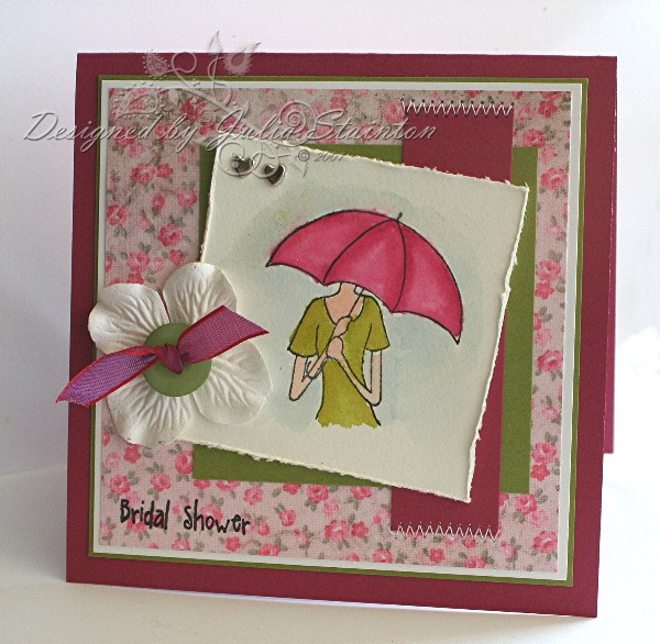
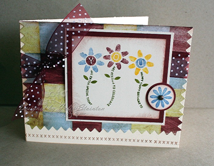
For this design, I started off with my stamp set and the color combo. A perfect combo. Can’t get much more girlie than a Bridal Shower. On my desk, this leftover scrap of Daisy D’s paper was sitting there, leftover from a design I created for a call yesterday. It worked perfectly so I just had to use it up. The Purely Pomegranate card base is layered with whisper white, old olive and this Daisy D’s floral.

I then went to work on the image, pulling out some watercolor paper, I stamped the design with my favorite Black Palette Noir Hybrid ink from Stewart Superior. I just love how this ink resists bleeding making it perfect for watercoloring. After watercoloring my image with my aquapainter, I distressed the edges. The Old Olive layer was overlapped with a strip of the Pomegranate that I zig zag stitched at each end. I rarely adhere things on an angle but this image seemed to work well that way. Before adhering it I added two little heart brads at the top to signify the love of the bride and groom to be.

I then tucked the sentiment down at the bottom by stamping directly onto the patterned paper. This Daisy D’s paper works well for that but try it on a scrap before you stamp. Some patterned papers resist the ink and don’t leave you with a good impression.

Quick Tip: If your patterned paper resists classic ink, use a craft or Versamark ink and then emboss the sentiment to make it more legible.

To finish it off, I just had to add a little white Prima flower. I think this batch is fast becoming my favorite. I love white flowers and I’ve been waiting for Prima to come out with a great white flower. This package of white hydrangeas comes in a beautiful tin. The button is from an awesome Autumn Leaves button package and is tied with some more of my new May Arts ribbon.

Technique Challenge…a birthday card

Well, I said I’d be back with a card design and I am! It is a LOT later in the day than I expected but I came through! LOL I was so mixed up what day today was. We were actually supposed to come home tomorrow and I think that is what was mixing me up! LOL You’ll have to excuse my photo..I’ll replace it with a better one tomorrow!

It has been quite a while since I’ve had time to try out a technique challenge and this is one I’ve done before…long ago! It is a double resist technique combining Clear Emboss Resist with Versamark Resist. I love the extra depth it gives. I needed a birthday card for my sweet little nephew and I decided to go with a Western theme for my design. Hope he likes it!

Western Birthday

jks-wanted-birthday.jpg

For the technique and main image panel, you first must stamp the images you want to be most prominent with Versamark onto glossy paper and then emboss them with clear embossing powder. After, you can fill in the background images by stamping with Versamark again. This time … Do NOT emboss. Simply brayer or sponge color over the top and your images will appear. Lightly wipe excess ink from surface with a tissue and your panel is ready to use. To get a distressed look to my panel, I used my Heidi Swapp edge distresser to fray the edge.

Quick Tip: distressing the edges of glossy cardstock is a little more difficult because of the extra thickness and the slick surface. I used my Basic Grey Precision file to sand the edges first ( you can also use sandpaper) before distressing to make it easier

For the main card base of my design, I used Creamy Caramel and stamped it with Linen and the Wanted Paisleys and then sponged the edges. The darling bandanna print is by Flair Designs. I stitched it to the card and then distressed the edges.

The main image panel was then matted with black cardstsock and then tied with some of my new May Arts ribbon. A tab at the top is a piece of Flair paper from the same line, punched, sponged and stapled to the top of the panel. I love my Crop-a-dile and I couldn’t resist adding a line of black Making Memories eyelets with it and then stamping the sentiment in front. The Happy Birthday is from the Lizzie Anne Designs Simply Sentiments set.

Back to Scrapbooking…a few ideas…

I had a comment the other day about how to get inspired to get back into scrapbooking. Now its been a long time since I had been scrapbooking… a few years to be precise. I must say, I’m only dabbling in it a little again. What actually started me back at it was a few articles I needed to write for Craft Critique. The companies that I was reveiwing, both were mainly scrapbooking companies and so, to be fair … I needed to try out a few layouts. I had a fabulous time with it again but I must say, my designing is going to remain predominantly card design and altered items. If this is what you are coming to see, don’t worry!

The biggest drawback I have with scrapbooking is time. Layouts DO take more time that cards. That’s a fact. The other thing is the thought that each page has to be perfect. It doesn’t. Just like life is a journey so is scrapbooking and designing…it all changes so don’t get caught up in that frame of mind. So…what inspires me to get started again…here is a short list…

  • take photos or get out some great older ones
  • go with a smaller format if 12×12 intimidates you – just bought some adorable Cosmo Cricket 8×8 that is absolutely darling and my fingers are itching to get to it, 6×6 is another great size…pages go together quickly and you can use one photo on a layout
  • buy a scrapbooking kit … there are so many cool ones out there – they make it sooo easy to coordinate and take some of the stress off of you finding things to match
  • buy or borrow a scrapbooking magazine…they are FULL of cool ideas
  • take a scrapbooking challenge – they are always a great place to jump off from and there are lots of them on-line (I don’t have any links off-hand. Sorry! I do know that Splitcoaststampers has a scrapbook forum with challenges as well as Two Peas in a Bucket If you know of other linkes to challenges…be sure to share them in the comments and I’ll edit them in to this post.)
  • buy plastic layout keepers – put paper, embellishments and photos together for a layout and then create it when you have the time
  • journaling can be intimidating – hide it if you like behind an element or just keep it short and simple…whatever works best for you
  • just get started – procrastination isn’t helping! Once you get at it, you’ll keep going
  • just have some fun – every layout is NOT going to be perfect so just enjoy the process 🙂

I hope this helps! A lot of these tips work well for card designing and other papercraft projects also. I’m just home from the cottage last night so I’m anxious to get organized and get back to designing. Check back in later…I’ll be sure to have something to share with you. 🙂

Vintage Style Layout

Some of you may have seen this project before. This layout is part of a Craft Critique review I did a few weeks ago on Hambly Screen Prints. I loved working with their gorgeous patterned paper and transparencies. It had been quite a while since I had done any scrapbooking and it was fun to get back in the groove.

I Wish You Joy

jks-i-wish-you-joy.jpg

To create this design, I used my Hambly Screen Prints on the background and then overlaid it with one of their transparencies. To hold them together, I stitched around the entire design in a free-style stitch. I printed off my photos in black and white and the same one again in a soft sepia look for a dreamy look. I wanted to try for a vintage look with their product.

The journaling on this design may actually not be visible at first glance. I tried out a Fancy Pants journaling card by layering it under one of my photos and just leaving the quote visible along the side. It also helps anchor the photos to the design.

The chipboard strip is from Stampin Up…the Ginormous Flowers chipboard set. i sponged the edges with Close to Cocoa ink and then added tiny pearls to the scallops. The May Arts ribbon is one of my faves and I brought in a little purple to the design by tying it around the chipboard. The Hydrangea Prima Flowers are some of my favorites as well and add to the vintage look of the design.

Simply Saturday – A Winter Fairy

A quick cool design for a very hot Saturday morning. 🙂 I decided that this fairy from Lizzie Anne designs might look pretty cute granting Christmas wishes to I used lots of white and cool colors to see how she would look. I think it makes a pretty cute different look.

Winter Fairy

jks-winter-fairy.jpg

For this design, I kept the stamping and layers to a minimum. Lately, I’ve been trying out a cleaner, ,simpler look on some of my designs. I still love distressing and layers but I’ve seen quite a few cards lately that are just getting more and more cluttered. Perhaps it is the heat, perhaps it is the huge quantity of designs I produce but I’m loving simplicity.

To emboss the bottom of this design, I used my snowflakes Cuttlebug embossing folder by Provocraft. I love the fresh look of the embossed white and I broke up the design by only embossing the bottom 2/3 of the design. For the fairy, I stamped her onto some Whisper White paper, watercolored her and then punched her out with my Marvy Scalloped Oval punch.

The ribbon is a roll I bought from Michael’s wayyyy back. The wide size can be bulky to tie, so I wrapped it around the card, leaving the ends well adhered on the front. After adhering my scalloped oval over top, I further secured it with a couple of eyelets and my Crop-a-dile. A Happy Holidays sentiment, also by Lizzie Anne Designs, quickly finishes off the top of the design.

If you haven’t already checked out the Sneak Peeks at Lizzie Anne Designs…hop on over. I just can’t wait to get my new sets. These sets will be on sale September 10th so stay tuned. 🙂

Wishing you all a safe and happy weekend!

Sunshine…a new digi design

Summer…it is my favorite time of year and wayyyy too short here in Canada. It is also one of the busiest times of the year for us as well and so I treasure every moment of it that I get. My favorite way to spend time in the summer is playing on the beach with my kids and sailing across Lake Huron. Of course…that is rare as I am usually the one of the beach with the kids. While on the beach, I usually have my camera on hand, making sure I can capture a special moment to cherish the rest of the year until we can make new ones on the beach again.

Sunshine

jks-sunshine-blog-size_edited-5.jpg

I’m on the beach again today so I just thought I’d take the time to share a digital design i created with some of my summer photos. Most of this designs was created from free digital kits by www.shabbyprincess.com in Adobe Photoshop Elements 5.0. Sunshine title was from the free digital kit that came with the Ultimate Guide to Digital Scrapbooking. I’ve been learning so much from this publication! It is totally worth the investment, many times over! It is a Better Homesand Gardens special interest publication adn you can find it at craft stores or bookstores.

Have a wonderful summer day filled with Sunshine!

Quilted Birthday….

This is a quick and fun birthday design using another of the Lizzie Anne Designs Singles stamps… I’m off for the day today. If you’d like to play along with today’s Ways to Use it challenge, make sure you check out the SCS Challenges forum. I have a guest hostess all lined up for you and I know she has a fun challenge for today!

Speaking of Lizzie Anne Designs… make sure you hop over there today! Today, tomorrow and Saturday, they will be showing sneak peeks of their fabulous new stamp sets soon to be released. I’ve been haunting my mailbox as I just can’t wait to get my hands on them! Sneak Peeks Here! 🙂

Quilted Birthday

jks-quilted-birthday.jpg

I once again, pulled out my Daisy D’s swatches and designed another card around it. I love the patchwork look of this paper…this one from the Lullaby Boy swatch package. I think it goes really well with the pinked edges…reminds me so much of sewing.

To ink up the stamp, I used my Stampin Up markers to add in the differenet colors before stamping it onto my very vanilla cardstock. A little sponging and matting and the main image was done. To tie in with the stitching, down-home theme, I stamped the darling little cross-stitches along the bottom of my design. This stamp is from the Lizzie Anne Designs Shapes and Stitches stamp set. To create a little embellishment, I stamped the flower from this set onto a scrap of cardstock and then punched it out with a circle punch. A tiny brad makes up the flower center and attaches it to the image panel. This card didn’t need another sentiment…the flower stems make it up already. 🙂

Have a fabulous day!

Supply List:

Cardstock: Very Vanilla – Stampin Up

Patterned paper: Lullaby Boy Swatch pack – Daisy D’s

Stamps: Lizzie Anne Designs

Ink: Close to cocoa, Brocade blue, ruby red, summer sun markers – SU

Other: ribbon – Michael’s, brad – Making memories, circle punches – EK Success