Category Archives: Craft Critique Project

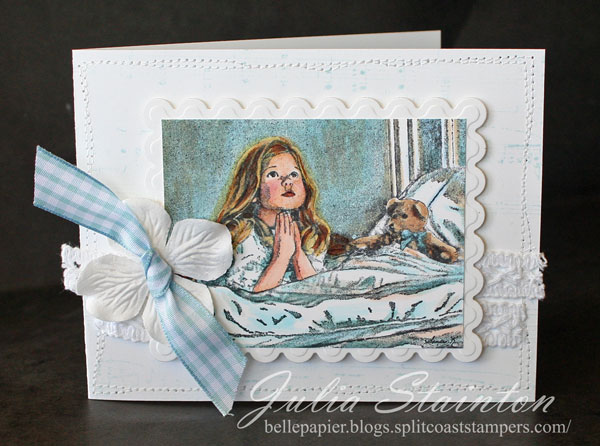
The Prayer…

I think this just may be one of my favorite images of all time…

40323_girlpraying_pg18_web.jpg

The Prayer is sweet and elegant and oh so beautiful. It actually reminds me of a picture that hung above my bed when I was a child. It had a scripture verse on it. Just for fun I googled it and actually found the picture to share with you here. I think the Sandra Kuck ThePrayer is even more beautiful and think it would make great altered projects and as I created for this design…a card to let someone know I’m praying for them. I actually designed this card for the daughter of a friend of mine. She flew off to Mexico to help a missionary family there for a month. The thing I really love about it is the stamped image even reminds me of her when she was as little girl.


In My Prayers…

jks-in-my-prayers.jpg

This design is actually more subtle in person. The Prayer is CHF’s new Sandra Kuck release. The designers have created some stunning samples. I hope you’ll take a peek here.

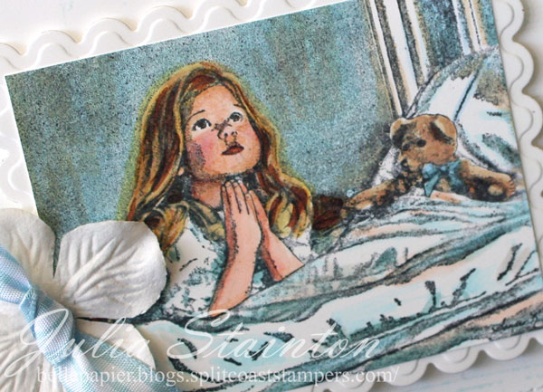
jks-in-my-prayers-close.jpg

To color this image, I used my Copic Sketch Markers starting very light and adding in color to build up the shading. You want to be able to keep these images as light as possible. To blend colors for the little girl’s face, first color it with an extremely light flesh color. Shade by picking up ink from a darker color with the tip of your light flesh marker. To keep the focus on the image and coloring…the rest of the design is very simple white design for a soft romantic style. Oh the background…you can see a sneak peek of our newest Scrapblock™, Aged Sheet Music. I know you are going to love it as much as I do. It will be released on Tuesday August 5th.

If you’re looking for a great coloring tutorial for these images…be sure to check out Lisa Silver’s Coloring Detailed Images Tutorial at CHF.

Have a great weekend!
Julia

Supply List:

Stamps:
– The Prayer (Sandra Kuck line) by Cornish Heritage Farms
– Aged Sheet Music Backgrounder by CHF

Ink:
Pitch Black Adirondack ink by Ranger

Paper:
-Simply Smooth White by Prism

Other:
-flower by Prima
-sewing machine
-vintage lace by Melissa Frances
-markers by Copic www.ellenhutson.com
-gingham ribbon by Making Memories

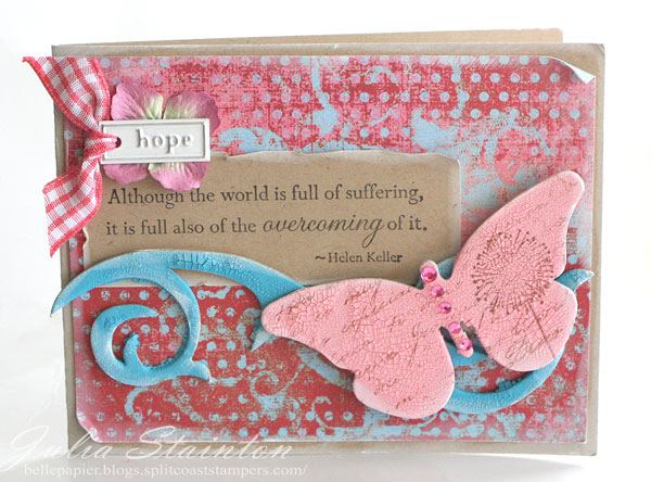
Hope

This is one of the those designs that I had no idea where I was going with it when I started! 🙂 I just knew I wanted to try out these Distress Crackle Paint colors on some chipboard. It just seemed to make itself into a hope card. I think it would be very appropriate to give to someone going through difficult times or someone with cancer. One thing I particularly love about this paint besides its texture is the ability to stamp on it. Another article I’ve written for Craft Critique was posted this afternoon. If you’re interested in reading about this paint…here’s the link.

Hope

jks-hope-design.jpg

I’m off to join my family sending off some fireworks so I’m keeping this post short! Wishing you joy and hope, today and always…

Julia

Supply List:

Stamps:

Motivational SEntiments (Mona Lisa Moments line) by Cornish Heritage Farms

-Spanish Script Backgrounder by Cornish Heritage Farms

-flower from Silhouette Blooms 2 (Kim Hughes line) by Cornish Heritage Farms

Ink: Black and Burnt Umber Palette Ink by Stewart Superior, White Pigment ink by Clearsnap

Paper: Kraft Cardstock by Prism, Patterned paper by My Mind’s Eye

Other: flourish chipboard by Maya Road, butterfly chipboard by Scenic Route Paper Co., Worn Lipstick and Broken China Distress Crackle paint by Ranger, rhinestone by MAMBI, flower by PRima, hope tag by Imaginesce, ribbon by Making Memories
Going Green

Monday, Monday…I’ve gotten to LOVE Mondays! Even if the kids are out of school for summer. 😉 I love creating designs for the Challenge Chicks Monday challenge and this week I’m really excited about it…a going green recycling challenge.

One of my favorite things, besides chocolate of course (that was LAST Monday), is my morning French Vanilla. It comes in these fabulous little tins from Maxwell House if you are in Canada. I think the name may be General Foods in the US but I may be wrong. These tins are perfect for recycling into lovely little gift tins with some paper and a strong adhesive.

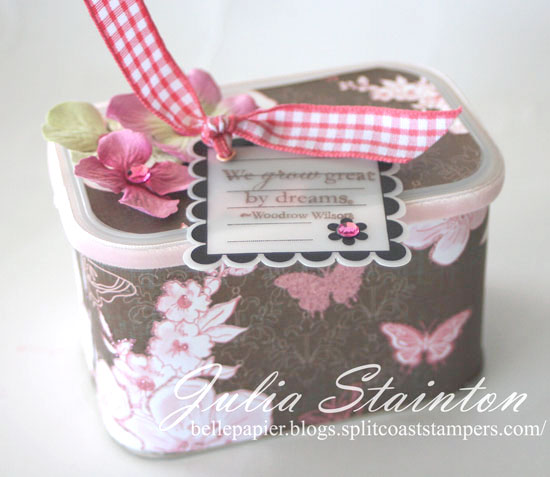
Dreams Tin

jks-dreams-tin-2.jpg


This little tin was designed for my daughter to give a gift in. A gift card, necklace, chocolates… they all fit really well inside. The patterned paper is from the Jolies Chocolats line by SEI. I just adore this pre-glittered paper. It just screams girl. Around the edges of the lid I adhered some Creative Impressions velvet ribbon. My pretty Primas are embellished with pink rhinestones.

The tag is the only part of this design with stamping on it. Sometimes that happens. Sometimes simple is best on a project. Don’t try and add more if it really doesn’t need it. 🙂 My sentiment is from the Motivational Centers set by Cornish Heritage Farms.

I hope you’ll join us and play along in this weeks challenge! You can check out the details here. Also check out what some of our other designers have created… Kim, Lisa Silver, Kristine, Dawn, Lesley & Val. I know you’ll love their projects!

Have a wonderful start to your week!
Julia

Sheer Fun

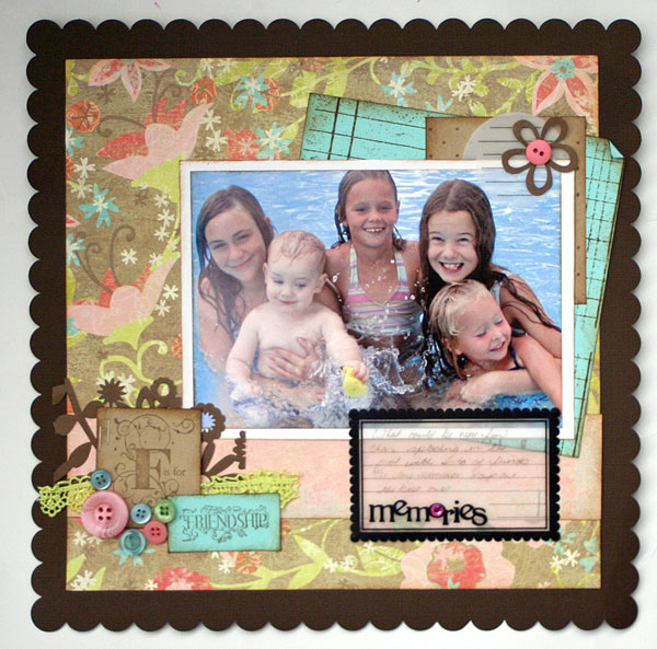
Summer friendship…splashing around in the pool…it’s sheer fun and one of those moments we always remember looking back. A decided to create a layout around a photo I had of my daughter, one of my boys and some friends splashing around in a pool. I decided to use this beautiful Crate Paper patterned paper as the base of my design and chose my colors from the patterned paper itself. If you read yesterday’s entry…you’ll have seen this paper before. 🙂 Here’ what I did with it.

Summer Friendship

jks-summer-friendship.jpg

Here’s my color combo from the ones I uploaded yesterday. The colors might be slightly different on your screen as I took the photo of the layout in different light.

cc12.jpg

This layout uses some of my rubber stamps to help me create the design. The Vintage Ledger Scrapblock™ is stamped onto a piece of Iced Teal cardstock while my Pindot Scrapblock is stamped on kraft cardstock. I love how easy it is to create my own coordinating patterned paper with these stamps. My sentiment stamps form the title of this layout. F is for Friendship comes from the For the Men stamp set, The Rummage Bin line, proving that this set is NOT just for the men. 😉

I created this layout for a product review I wrote for Craft Critique on Maya Road Office Sheers! I just LOVE these sheer embellishments and worked two of them into this design…the memories one with journaling on it and at the top, a Office Sheers journaling tab that is simply embellished with a flower and button. Want to read more about them? Check out the article here.

Have a fabulous day! Tomorrow is another Ways to Use it Challenge. I hope you’ll set aside some time to play along!

Julia

Supply List:

Stamps; For the Men (The Rummage Bin line), Vintage Ledger Scrapblock™ & Pindot Scrapblock™ all from Cornish Heritage Farms

Ink: Burnt Umber Palette ink by Stewart Superior, Vintage Photo by Ranger

Paper: iced Teal, Kraft, Simply Smooth White by Prism Papers, Brown scalloped cardstock by Bazzill, floral patterned paper by Crate Paper, die cut paper by KI Memories

Other: buttons by Autumn Leaves, lace by Prima Marketing, Office Sheers by Maya Road, lace by Prima, rhinestone by MAMBI

Sweet

Summer is sooo sweet. I’ve been finally printing off my photos from last summer and using them in layouts. It’s making me long for more beautiful days. I just love the beach…the sound of the waves and the endless lazy days with the kids.

I created this layout using my new Crop-a-dile 2 Big Bite. I loved the original Crop-a-dile so much that I just had to try out the latest version. I love how you can now use it on 12×12 scrapbooking layouts. This layout is part of a Craft Critique Review I wrote about the Big Bite. You can check it out here...

Yet another update…My dad is now home from the hospital. We’re taking turns staying over and keeping him company. I’m so grateful that he seems to be improving steadily. I’m hoping for some time to get things caught up though as I feel like I’ve been through a whirlwind!

Sweet Sweet Summer Days

jks-sweet-sweet-summer-days.jpg

I was actually wondering what to do for this design. I knew I wanted to use a 12×12 layout with my Big Bite but hadn’t come up with anything when the new May Page Maps link came in my inbox. I’ve actually never tried one of these sketches but this gorgeous layout just called my name. I love it when inspiration strikes! I knew with this stitched circle that I’d need a photo that had all the main elements to the right side. You don’t want that stitching cutting through the main focal point.

I was so excited to find this photo worked perfectly. It’s one of my absolute favorites. In person the silhouettes are so sweet. You can even see the water dropping off the little girl’s hand. The little girl is the daughter of a friend of mine and while older, she is so sweet with my little guys. This layout is called Sweet for those sweet summer days and sweet childhood friendship.

Part of the charm of this layout is the circular stitching and the eyelets that highlight it. To create my circle, I simply cut out another circle the same size as the orange one on my layout and adhered it with temporary adhesive. It was so easy to stitch around it the same distance from the edge all around and then remove. My Big Bite made it fairly easy to add in the eyelets around the design without worrying about the distance that my original Crop-a-dile could handle.

I love adding small touches of stamping throughout my layout. I especially love the quote from the Motivational Centers set by Cornish Heritage Farms. Make each day your masterpiece.

Hope its a wonderful one!
Julia

Supply List:

Stamps:
-Moments to Remember sentiment & What I love from the Ledger Me stamp set (The Rummage Bin line) by Cornish Heritage Farms
-Summer sentiment from the Great Canadian Stamp Set stamp set (The Rummage Bin line) by Cornish Heritage Farms
-Make each day sentiment from Motivational Centers set (Mona Lisa Moments line) by Cornish Heritage Farms

Ink:
=Black Stazon by Tsukineko
-Espresso Adirondack ink by Ranger

Cardstock: Prism

Patterned Paper:
-plaid by My Mind’s Eye
-dotted pale blue by Making Memories
-shiny polka dots by Making Memories

Accessories:
-jumbo ric rak by Creative Impressions
-flowers by Prima
-eyelets by Making Memories
-gaffer tape by 7 Gypsies
-vinyl stickers by American Crafts

Tools:
-sewing machine
-Dymo label maker
-Crop-a-dile 2 Big Bite by We R Memory Keepers

The Beautiful Time…. a layout

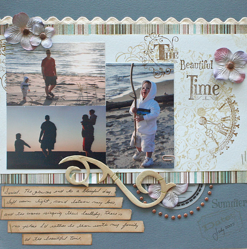
Do you have a favorite time? I’m mostly a morning person and am most productive in the morning. One of my favorite times of the day, especially in summer is the evening. Things are cooler, the light softer and I especially cherish the evenings spent walking on the beach. I can’t wait for those lovely times to come again. For the layout below, I put together a design using moments captured from a walk last summer with my family.

This layout was created for a Craft Critique review that I wrote about Creating Keepsakes Magazine. Creating Keepsakes is one of my favorite scrapbooking magazines. Although I don’t do many layouts these days…I’m hoping to get back into it more. Scrapbooking is how I got into stamping and card design and I love creating beautiful layouts. Even if you don’t scrapbook, Creating Keepsakes is a fabulous resource of designs, colors, products and techniques for any papercrafter. To create this layout, I used three different sources of inspiration from April’s issue…a layout design from the sketches pages, stapler inspirations from a Tools and Techniques article and from Alli Edward’s scrapbooking advice article…I used some hand-written journaling. Now I’m not so sure that anyone will be able to read it but hey… I tried and my descendents WILL have a copy of my handwriting. 😉

While not used on this layout…my stamps seem to have found the postal black hole… I just wanted to let you know about a new release from The Rummage Bin line. Lesley has been hard at work and has two beautiful new offerings this month. Photo Op is a gorgeous fun scrapbooking set that can also be used in cards as well and a new backgrounder stamp called Shady Daisy. You need to check out the samples with these sets…some great fresh ideas! Scroll down to the end of the post to check out these new sets!

The Beautiful Time

jks-the-beautiful-time.jpg

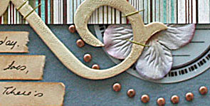
I designed this page around a Sophisticated Swirls backgrounder stamp and some stamps from the beautiful Rummage Bin line by Cornish Heritage Farms….Beautiful, Time to Stamp, The Ticket jks-the-beautiful-time-crop.jpgCounter and Story Book. It is a bit hard to see in the photo but I painted the chipboard flourish with Old Paper Crackle Distress Paint to add texture. The Jumbo rick rack and brads are from Creative Impressions. Just in case you actually want to read the journaling but can;t…

Sunset. The glorious end to a blissful day.
Soft warm light, sand between my toes,
and the waves singing their lullaby. There’s
no place I’d rather be than with my family
at the beautiful time.

Wishing you a beautiful day…

Supply List:
Stamps:
-clock and time sentiment from Time to Stamp(The Rummage Bin line) by Cornish Heritage Farms
-flourishes and Beautiful sentiment form Beautiful stamps set(The Rummage Bin line) by Cornish Heritage Farms
-The sentiment from Story Book stamp set(The Rummage Bin line) by Cornish Heritage Farms
-Sophisticated Swirls backgrounder by Cornish Heritage Farms
-ticket from The Ticket Counter (the Rummage Bin line) by Cornish Heritage Farms

Ink:
-Burnt Umber Palette ink by Stewart Superior
-Tea Dye, Brushed Corduroy & Antique Linen Distress Ink by Ranger

Cardstock:
-Prism Papers

Patterned Paper:
-Basic Grey

Accessories:
-paperclip from Creative Impressions
-brads from Creative Impressions
-rick rack from Creative Impressions
-Old Paper Distress Crackle Paint by Ranger
-flowers by Prima Marketing
-journaling Office Sheers by Maya Road
-flourish chipboard by Maya Road

Tools:

-stapler

Shady Daisy

shady_daisy.jpg

Photo Op

photo_op_.jpg

A Single Flower…

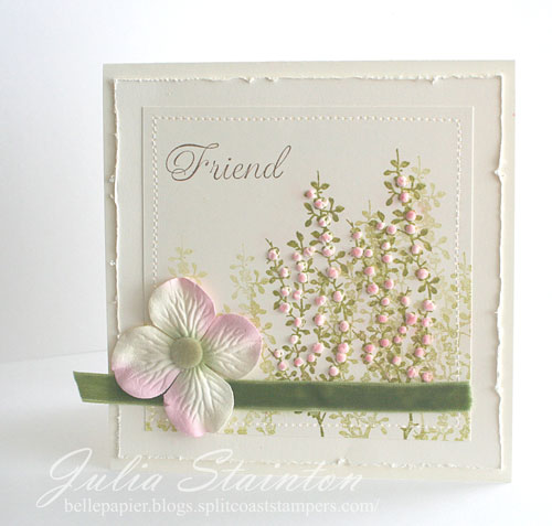
It’s not too often I use just one flower stamp to create a design. A few years ago when I first started stamping, this would have been much more common. I love the idea of going back and creating simple designs. Or maybe…not so simple but with a limitation of earlier days when you had a limited supply list to work from. I love how it stretches your creativity to use stamps and products in new ways. Sometimes I think we lose that. That is what the Limited Supply Challenge is all about. I’m loving today’s challenge…to use a single flower stamp and a single sentiment if desired. No patterned paper, no Cuttlebug. I went a step further and limited myself to a single color of cardstock, using just three layers. Check out the challenge at LSC157 if you’d like to play along! :0

Springtime Friend

jks-springtime-friend-2.jpg

For this design, I simply stamped my flower image multiple times in Lettuce Adirondack ink. This flower is from the Kim Hughes Silhouette Blooms 1 set from Cornish Heritage Farms. After stamping…I dotted my blooms with Liquid Applique and then gently heated with my heat gun. I then lightly sponged on rose colored chalks from my Pebbles chalk set. Very easy and very much like spring. 🙂

To define my edges, I distressed and stitched them for added interest. The Friend sentiment on this design comes from the Silhouette Blooms 2 set also by Kim. To play up the textural elements of this design, I added a strip of soft green May Arts ribbon and a moss velvet brad from Making Memories.

Thanks for stopping by…again! ….today. 🙂 I certainly did not plan on blogging again but just couldn’t resist this challenge! 🙂