I’ve been searching for a little inspiration lately. I needed a bit of a break so I took it, but for some reason, this time it’s been really hard to get back to designing again.
So…..
What to do?
Well, I turned to some of the things I’ve done in the past.
- took some more time away
- took some time for myself…I’ve started going back to the gym
- bought some new crafting goodies
- cleaned up by craft space (well, mostly!)
- found a challenge that inspired me
It wasn’t any one of these things on their own but probably a combination of all of them. And so finally, I’m back in my craft room making things. I hope it lasts!
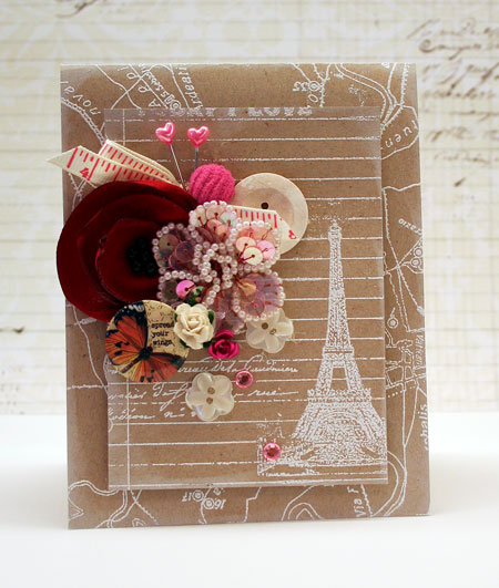
Part of what got me designing again was a challenge. I love the CASE Study Challenge Blog and it’s been awhile since I’ve participated so it was one of the first places I went for inspiration. What clinched it was the muse for March is my good friend Julie Ebersole. Julie has been inspiring me for YEARS and I just had to play along with this challenge. This weeks inspiration piece is just stunning so please, check out the card and the challenge here.
I was inspired by the beautiful white embossing on Kraft cardstock and her stunning use of the pop of warm vibrant color. The simple layout is basically the same too.
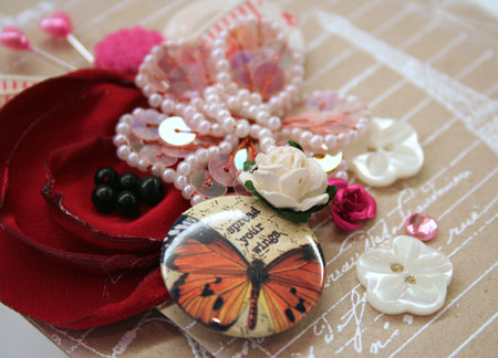
To change it up, I’ve created my card in my own shabby, embellishment cluster style. I couldn’t resist a new Hero Arts stamp I just ordered that arrived in the mail. I just adore that Eiffel tower and this card design is going to find it’s way to my sweet daughter. She loves mail and all things Paris so I know she’ll enjoy it.
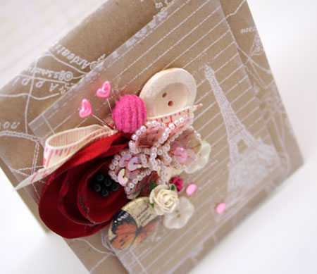
The embellishments are an eclectic combo of many different colors, manufacturers and items. I always find it so fun to play around with seeing what will mix and match together.
Happy creating!
Supplies:


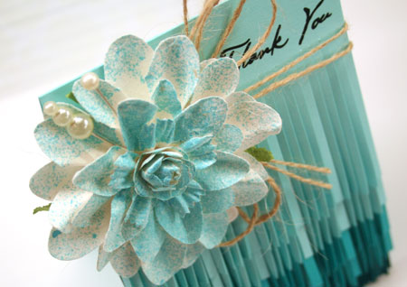
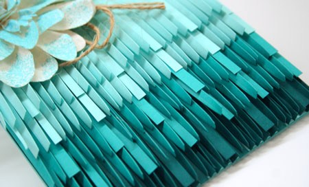
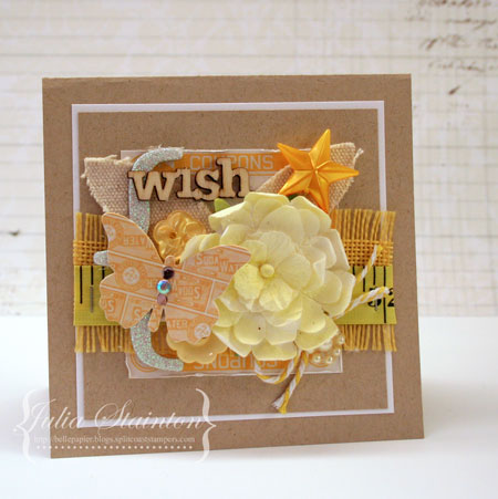 A little bit of this and that makes a fun study in lemon. Once again I’m using up my bits and pieces to make a fun card. It’s a fun way to clean the stamp room and it’s also a great way to ease back into creating.