Monthly Archives: October 2012

more texture

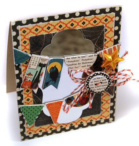
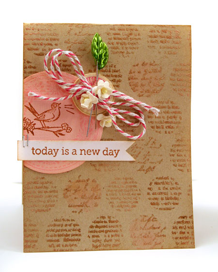
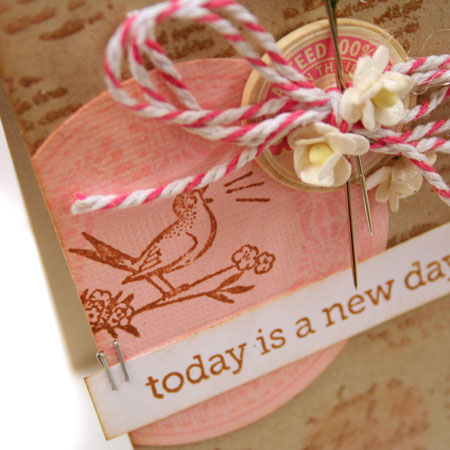
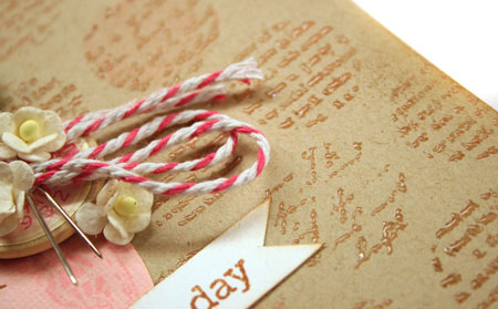
Right now I’m stuck on texture. It’s always interesting to have somethign in particular you are focused on when designing and of late, that has been texture. In particular I’m loving the corrugated Kraft paper. It’s so interesting for a neutral. It’s linear and textured and it goes with pretty much anything.

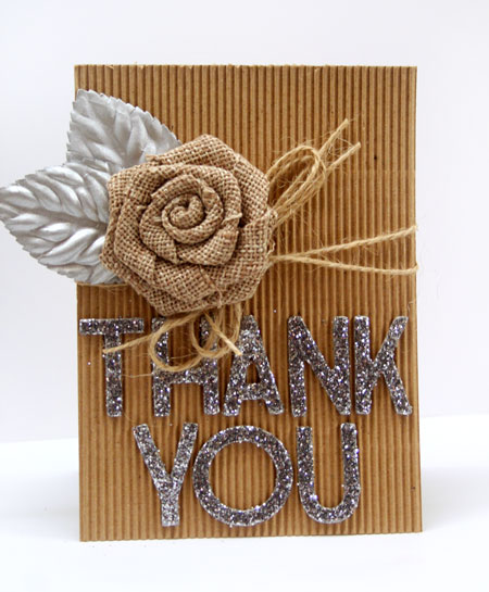
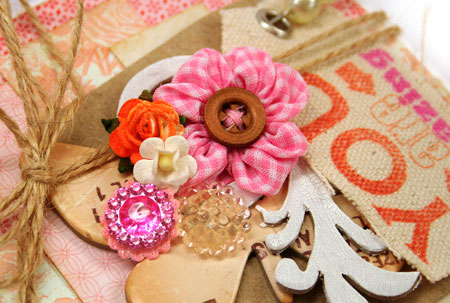
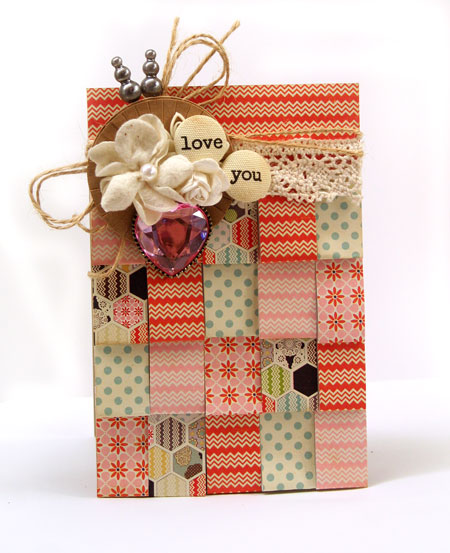
So how about pairing it up with an unusual combo of some silver glitter and leaves?

I hope everyone is managing to stay safe, warm and dry in this crazy weather. It’s crazy windy and wet even here in Ontario and I can only imagine how it would be on the East Coast.

Supplies: leaves by Prima, flower by Maya Road, Corrugated Kraft paper, twine and Glitter Thickers by American Crafts

Take care!

Reflections

Crime tape, pumpkins, spiderwebs and all kinds of ghoulish decor are popping up in the neighbourhood. With Halloween around the corner, I thought I’d create a fun Halloween card design for today’s post in the CLASSroom.

I’ve also tried out a really great new product that I’m really excited about. Stop by the CLASSroom and join me for more photos and the tutorial.

Have a fabulous weekend!

case study no. 4

I’ve said it before and I’ll say it again…

There’s nothing quite like a challenge to get your creativity going.

Being the October Muse this month for the CASE Study Challenge Blog has been an honour, so much fun and a real blessing in jump starting my love of crafting again. This is my last week to play along with the design team but I believe I’ll be playing along in the future as I find the time. It’s such a great challenge as the sky is the limit. One of the things I’ve been so impressed with it seeing all the unique designs that are created each week in so many different style. Now that’s impressive and very inspiring.

Today’s inspiration design can be found here. You’ll see that I jumped away from the layout for inspiration and focused on texture and corrugated cardstock. My original design was a different style, much cleaner but I thought a more shabby style would play up well with all that texture.

Quick Tip: Highlight textures by brushing with Distress Crackle Paint.

This stunning butterfly was the first piece I picked out to work with on this design. It was sitting on my desk just begging to be used and I thought that it’s subtle white color and lovely raised design would work well with a textural design. I used a hot glue gun to adhere it to the design for a firm bond.

Supplies:

Enjoy your day!

Watercolor Tulips

She’s home! My daughter, that is. Three in the morning is an awful time to arrive but very much worth the wait. We have a crazy busy week planned and I can’t wait to get started. Road trip today!

A few weeks ago I was playing around with watercolor paints. Not the ink refills but the actual tubes of watercolor paint. While I was experimenting I ended up doing a little freestyle watercolor sketch and made it into a card.

The great thing about watercolors, is their transparency and fluidity lend themselves well to a very informal and rough simple style. When you watercolor it doesn’t have to be perfect.

To make the tulips, I started out by making rough oval shapes with a very light application of my hue. As it dries you can add layers to build up the color and add some definition to the image. The leaves and stems are just simply long quick brush strokes that trail off.

Quick Tip: Try experimenting with different mediums. Explore your creativity and think outside the box or in this case, outside stamped images. You can do it!

Have a creative day!

hodgepodge

I miss my daughter.

This year has been easier in some ways as I’m slowly getting used to her being away at school. On the other hand, the visits have been much fewer as she’s busy with a job this term as well. I applaud the initiative but worry about how she’s going to balance it all.

Next week she’s going to be home for reading week and I’m thrilled. We have lots of “girl” things planned. With so many males in this house, I’m really looking forward to it!

Today’s card is one that I created from a hodgepodge of paper scraps and embellishments that were on my desk. Don’t you know that the best way to clean is by using things up? Multitasking at its best! A cleaner desk and a card made to give away as a bonus.

When you look close you’ll notice that really, nothing much here matches or is repeated more than once. The trick is to cluster it together and to balance the colors of the items to make a pleasing whole.

When I was missing my daughter, this card made it’s way across the miles and cheered us both up.

Do you have someone you’ve been thinking of? Send them a piece of your heart to let them know you care. Don’t worry about perfect. It’s the thought that counts.

Supplies:

Have a fabulous weekend!

case study no. 3

The weeks are flying by here and it’s Thursday again. Time for another CASE study project to share with you. I apologize for pretty much dropping off the map this past week. I truly thought that Fall would bring a slower pace to my life. I think perhaps I just need to learn that life with a large family never slows down.

This also brings me to the sentiment on today’s card design…Today is a new day. I’m so glad for each morning when the day arrives fresh and new and full of possibility. I’m so glad that each new day brings the possibility of something wonderful.

For the month of October, a few of my designs have been chosen as inspiration on the CASE study blog. You can find this week’s inspiration and the challenge here.

There are a few things I’ve been inspired by from the original design…

  • layout
  • dotted background
  • a cardstock and stamping focus…no patterned paper

To add extra dimension to the stamped background, I sprinkled the Distress Ink with clear embossing powder while it was still wet. I love the subtle tone on tone shine. While the original design had a smaller image repeatedly stamped to create the background, this card uses a text/circle background stamp which makes it lovely and quick to do.

Supplies:

Happy creating!

case study no.2

It’s Thursday and I’m excited to be back with another case study inspiration piece for you. If you missed my post last week, I’m honoured to be the October Muse for the CASE Study ChallengeBlog. This week there is a new inspiration card for you and I’m playing along with the CASE Study designers with a new spin on it. To see the inspiration design and all the great twists on it, be sure to stop by their blog here.

Last week my card design was an interesting departure from the original but this week I decided to stay a little truer to the inspiration piece. Instead of using layers of tape measure trim, I’ve folded little strips of patterned paper in half and then adhered them for a fringe-like effect.

A cluster of goodies is always my favorite way to embellish a design. These lovely Cosmo Cricket Brads come pre-printed with lovely words to create a sentiment.

The new Lily Bee Persnickety line is one of my recent favorites. Such sweet colors and prints. If you’d like to recreate this card with the folded fringe layers, I cut a couple 3/4″ strips from the 6×6 papers and then cut them into 3 inch lengths. Fold the cut strips into half and adhere starting from the bottom layer and working up. The finished card base will be 5.5 x 3.75″ in size for a perfect fit.

Supplies:

Have an inspiring day!