Design is one of those essential elements of card making. You know how you look at a card and think, something’s wrong but I’m not sure what? Well, usually there is something wrong with the design.
Design is one of those things that may come naturally to some but it is something that everyone can learn. I like that. Learning is a good thing. I’ve learned a lot since I started creating card designs. I must admit I cringe a little to see those old designs from years ago but that’s OK. It’s all part of the process.
Now that the kids are headed back to school, how about learning some new things yourself? The newest special publication from Paper Crafts magazine is called Card Design Handbook and it is packed full of inspiration and most importantly, lessons in design.
Today ten of the designers from this issue are having a blog hop and each are featuring an element of design. I’m not quite sure why I picked white space to tackle as a design element as it’s a bit of a tricky one. I mean really…white space doesn’t even have to be white! How’s that for confusing?
So let’s talk white space.
White space is a term talking about space where nothing is going on. It’s the negative space and I’ve often thought of it as the space where a design breathes. Not every design has white space and that’s OK. Let’s focus on designs that do use it and how to think about it.
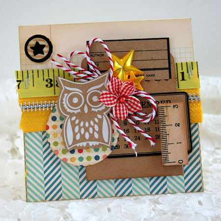
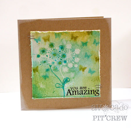
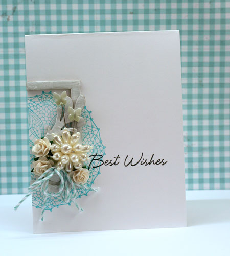
First of all I’ve created a card that has some white space in it. There’s not a ton but there is a nice white space border around the edges of the card. The white space allows your focus to be drawn into the center of the design.This card is really pretty but perhaps a little boring. I think it could be better with a little more white space.
Remember that this space doesn’t have to be white like this design. It can be black or any hue you wish. It’s just a quiet space. White space is especially lovely in clean and simple or elegant design styles.
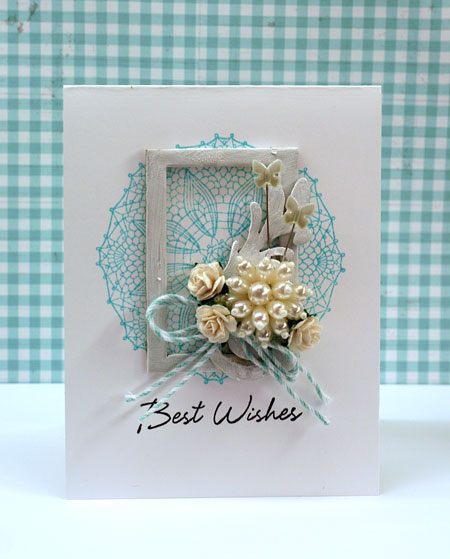
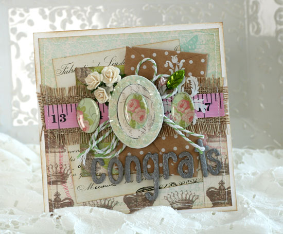
Now here’s my second card design. I’ve used exactly the same product to create this card but just changed up the layout a bit.
By making a small change on where I’ve placed my embellishment cluster, I’ve added more white space and changed up the design. By placing my embellishment cluster at the sweet spot (another design term you’re going to learn about in the Card Design Handbook), it draws your eye to the sentiment. The sentiment is now easy to read, not hidden like an afterthought and the main focus of the design.
I’ve created a couple sketches to help you visualize the white space in these designs. Focus on the black areas of the design. That is the white space. The negative space. I’ve made it black so that it will jump out at you. Look at the shapes it makes in the black when designing with white space. Note that these are NOT full detail sketches. They are simple so that you can focus directly on that white/negative space.

This first design is a very classic sketch. I admit I’ve turned to it time and time again and a very simple design. Central focal point. Sentiment below.
 This second sketch is of my improved white space design. Focusing on the black area, I really like the shape of the “white” space. It’s a nice large area to the right of the design. The design may be heavy in embellishments on the left side but having such a large area of white space balances out the design. Having that sentiment surrounded by the white space makes it really easy to read. Your eye naturally wants travel from left to right along with the text. A lovely card is important but really, you are giving this card to say something, right?
You see? White space and movement and the sweet spot and balance…they all work together. Design is cool like that!
Now that we’ve gotten through this long tutorial, you may decide you like the first project best. That’s fine. Design is all a matter of taste. Guidelines are just that. Simply guidelines to follow and there is always exceptions to the rule. Learn the guidelines, think about them and then decide how you want to use them to make your own creations that much better.
Now if you’ve stayed with me this long, hopefully you’ve learned a little something about design and you definitely deserve a prize. I have ONE copy of the Card Design Handbook to give away to one lucky person. For a chance to win simply comment on this blog post before midnight EST Tuesday August 28th One comment per person please! I’ll be randomly drawing a winner and posting on this blog the winner as soon as I can afterwards. Please be patient as I’m moving my daughter next week and I’ll get it done as soon as I can.
There are so many talented designers participating in this blog hop with some great ideas about design. Make sure you hop along to each of these blogs to learn more and also be sure to comment on their blog posts as well for more chances to win a copy of the new Card Design Handbook from Paper Crafts Magazine.
- Chan Vuong
- Kalyn Kepner
- Julia Stainton *you are here*
- Jocelyn Olson
- Angeline Yong Jeet Leen
- Jaclyn Miller
- Lorena Cantó Lavería
- Amy Wanford
- Emily Branch
- Vanessa Menhorn
Next you are hopping along to see what Jocelyn Olsen has to share with you today!
Have a fabulously fun and creative weekend!
Supplies:


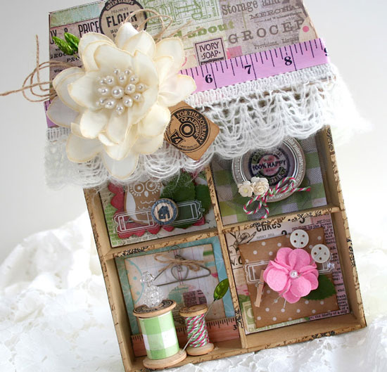
 I’ve combined lots of Maya Road goodies with the Epiphany Crafts Oval Shape Tool. I love how the glossy ovals contrast beautifully with the textures of the other embellishments. Ovals don’t always nest well, depending on their proportions so I was really excited to see how well the Epiphany Crafts ovals layered over Maya Road’s chipboard oval shapes.
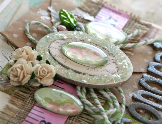 Today I’m sharing this project and another one on the Maya Road blog. Stop by for some inspiration and also a chance to win some Maya Road and Epiphany Crafts goodies!