
In between awaiting for glimpses of the CHA displays…a few of the Cornish Heritage Farms designers and myself decided to have a little challenge. We’re the extremely jealous ones at home the ones blessed to stay home with our loved ones, and decided to have a little fun too. Well…I’m not having too much fun here with the renovations but hey! I needed an outlet today! This seems to be the never ending renovation/addition. DH is very talented and doing 95% of it himself. Of course… it will be extremely well done and the only way to afford it but the drawback is…it started in September and consumes every waking moment he is home from work. Thanks so much ladies for all the kitchen color combos. We’ve decided on a color…I think. It is Benjamin Moore Bed of Ferns and is something of a cross between SU’s True Thyme and Prism’s Birchtone Medium. DD is not happy with the choice but hey! when she has her own kitchen, she can choose. With the amount of time I spend in there daily cooking for seven people I need SOOTHING, baby!
Today’s challenge was to use Birchtone Dark, Intense Pink, Papaya Puree Dark & Spring Willow Green medium as a color combo. I picked this color combo for the Cornish Heritage Farm’s CHA display for Kim Hughes’ line. I love pink and orange together! You can check out some pics of the booth display here. Make sure you check out the other CHF designers’ blogs for their designs as well.
Dawn, Anne, Mary, Tami, Kristine (yes, Kristine DID go to CHA but she is home again and raring to play:) )
Hey Tweetie
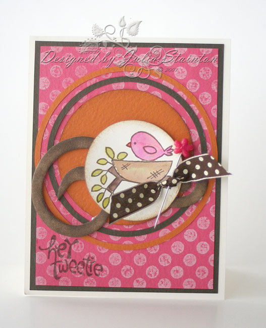
I was trying to decide what stamp set to play with today when I realized that even though I’ve made quite a few designs with Kim’s Pretty Birds set…I’ve not made any for my blog. That clinched it…I just adore these little birdies and masked the nest, branch and bird together for a fun image. The only piece of Intense Pink I had left was already inked and stamped with the Large Polka Dots backgrounder stamp in white craft ink so I pulled the design together from there using some of my favorite accessories.
We have another fun challenge planned for tomorrow so stay tuned! And if you want to play along…feel free. Just link your designs in the comments section of one of the blogs and we’ll come take a peek. 🙂
Supply List:
stamps: Pretty Birds (Kim Hughes’ line) & Large Polka Dots backgrounder – Cornish Heritage Farms
cardstock: Natural Smooth, Intense Pink, Papaya Puree Dark, Birchtone Dark – Prism
Ink: White Craft ink, Burnt Umber Palette ink – Stewart Superior, Latte, Raspberry, Espresso, Lettuce Adirondack inks – Ranger
Other: Fashion pin – Fancy Pants Designs, ribbon – Creative Impressions, circle cutter – EK Success, flourish chipboard – Maya Road
9 responses to “A color challenge…”